Samsung Mobile Lab was an R&D based in SF, CA. I joined the Lab in 2013 as a Staff Designer and worked on projects spanning wearable concepts, developing and launching new products, IPs, and multiple software innovations.
Role
Staff Product Designer
Problem
As the number one manufacturer of mobile phones in the world at the time, Samsung was at risk of becoming diminished to a hardware manufacturer. The company lacked an empathetic understanding of user needs for its flagship Operating System, translating into a UX that was hard to use and learn.
Contributions
I worked across the end-to-end design process from user research, IA, interaction, and visual and motion design. My contributions included the concept and design of user modes, the new developing new device-to-device management, the task switcher, and the new notifications system.
Impact
The result was an OS that was relevant, predictive, quick, and unique. It featured many core innovations under the hood that enabled Samsung to offer a unique value to its users, allowing the company to establish a unique perspective on UI/UX design. Pure was crucial in later OS iterations the company released in consecutive years.
UX Research and Strategy
Due to time and resource limitations for the project, I focused on deploying research methods that allowed the team to develop a unique perspective on critical user problems to help limit our scope and guide focus. Therefore, I focused on uncovering the most important insights that enabled the team to build a strong design foundation to inform consecutive design decisions.
I started by mapping key problem areas and inconsistencies in the OS to allow me to compare and understand statistically how Samsung OS scored against existing competitors. I also interviewed users who used Samsung OS daily to understand their core problems, frustrations, and expectations. I focused on users with particular demands from their OS to find opportunity areas.
To conclude this phase, I synthesized my learnings to gather the whole team's perspective on potential focus areas. The four areas below emerged from team workshops I led and resulted from a collective team effort.
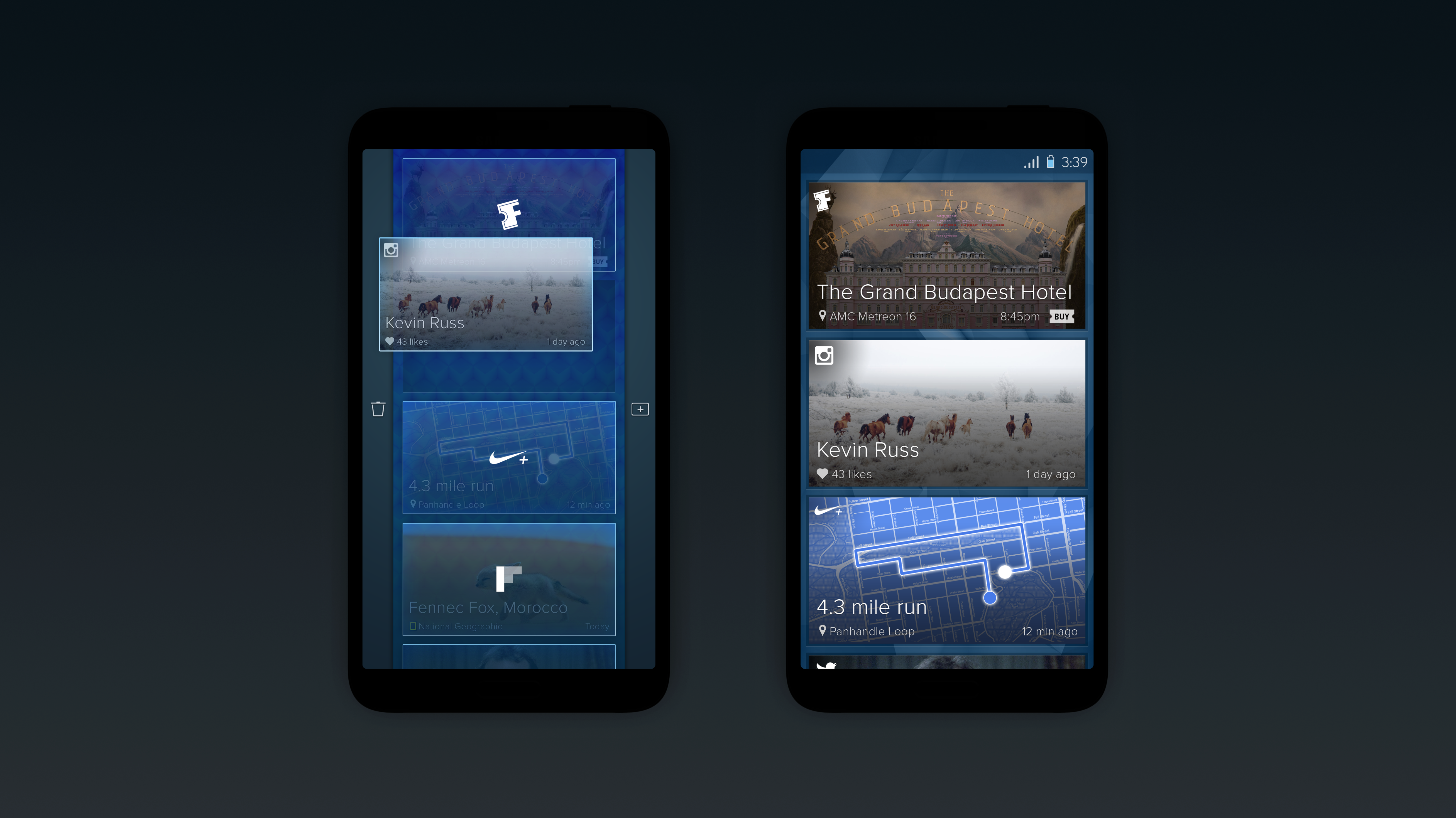
Focus on the people to bring down the noise.
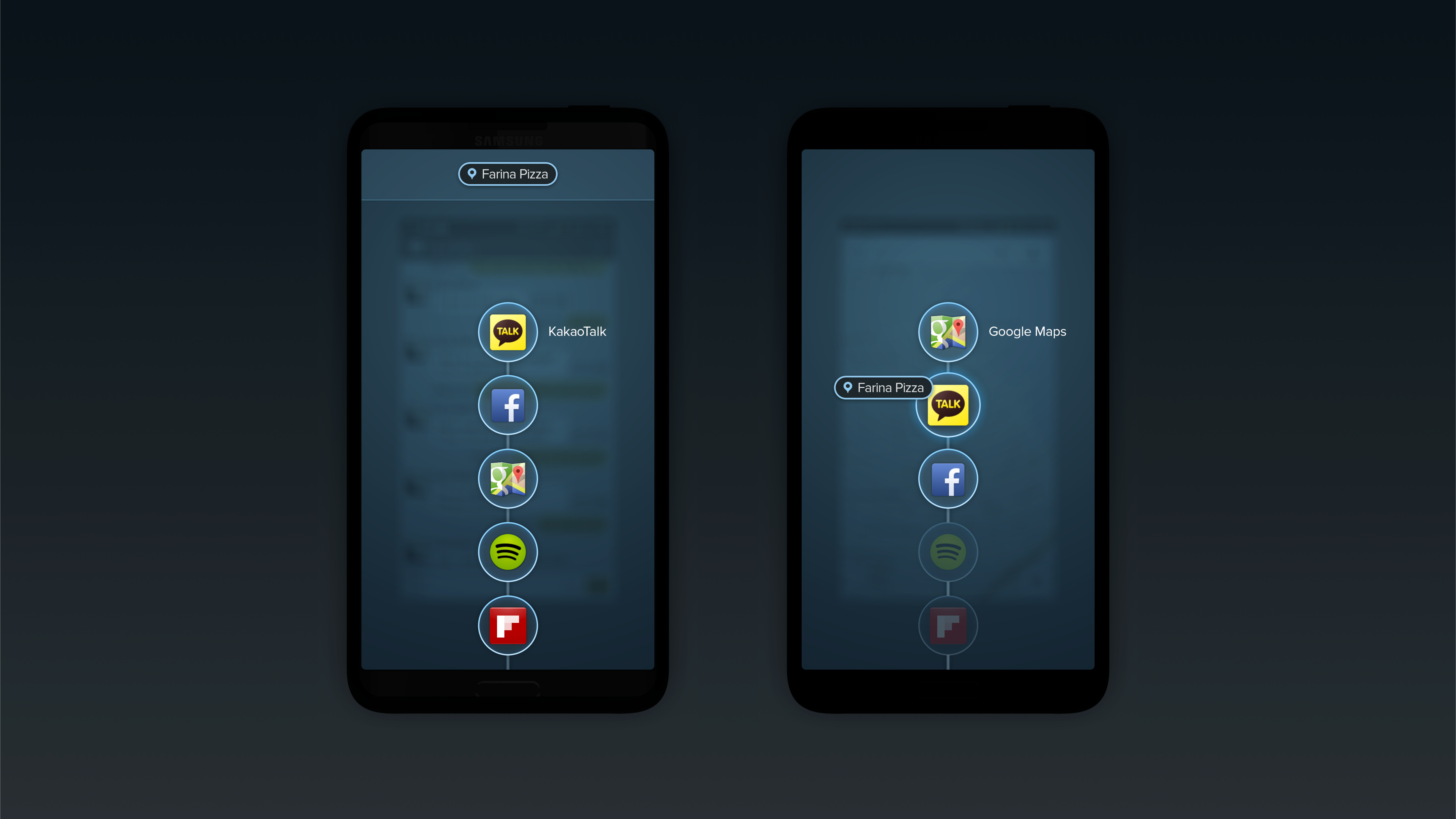
Our interactions with people happen across many apps and social networks, and a conversation that starts on SMS might transition to Facebook and other group chat apps. The OS should help users focus on people to remove the noise and distractions that get in the way.
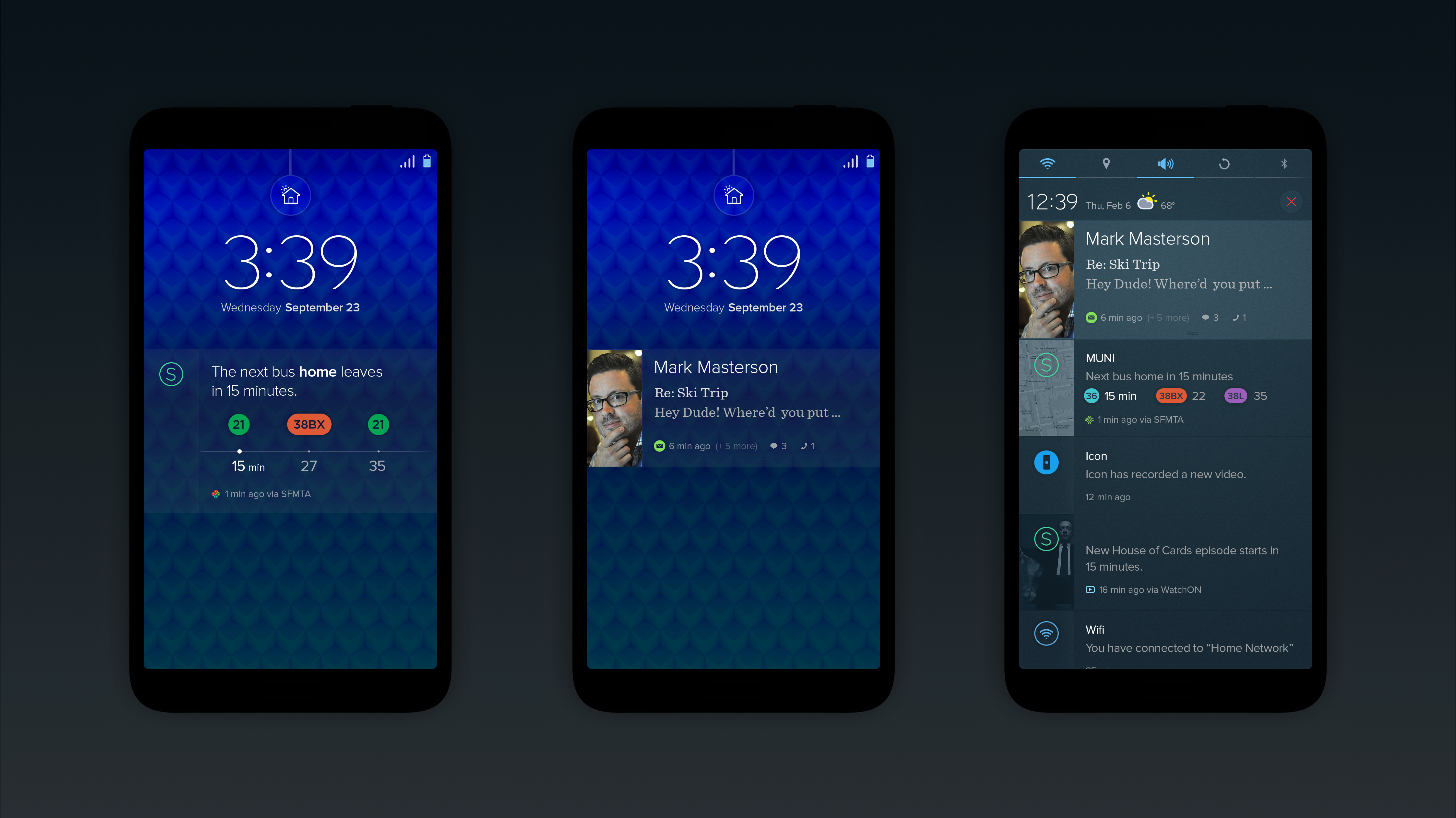
Contextual and predictive
Mobile phones have become an extension of ourselves, with most users relying on their phones to think and plan various activities. The OS should provide clear access to apps in a consistent, predictive, and contextual way.
Simple yet unique
We are designing for many users, from kids to the elderly. Because of this, the OS needs to be extremely simple and clean. Memorable moments such as animations and micro-interactions help build a unique OS without adding unnecessary clutter.
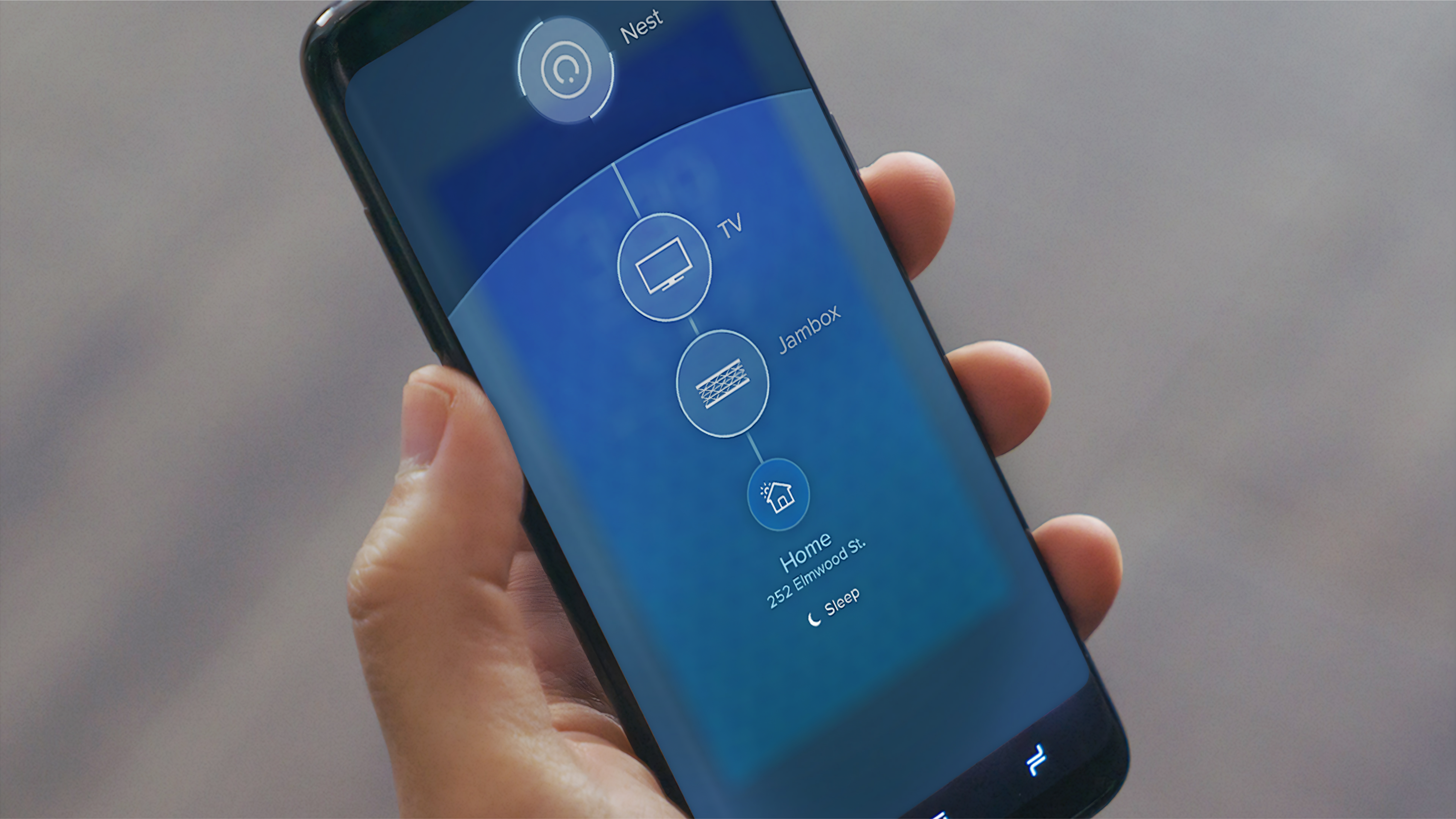
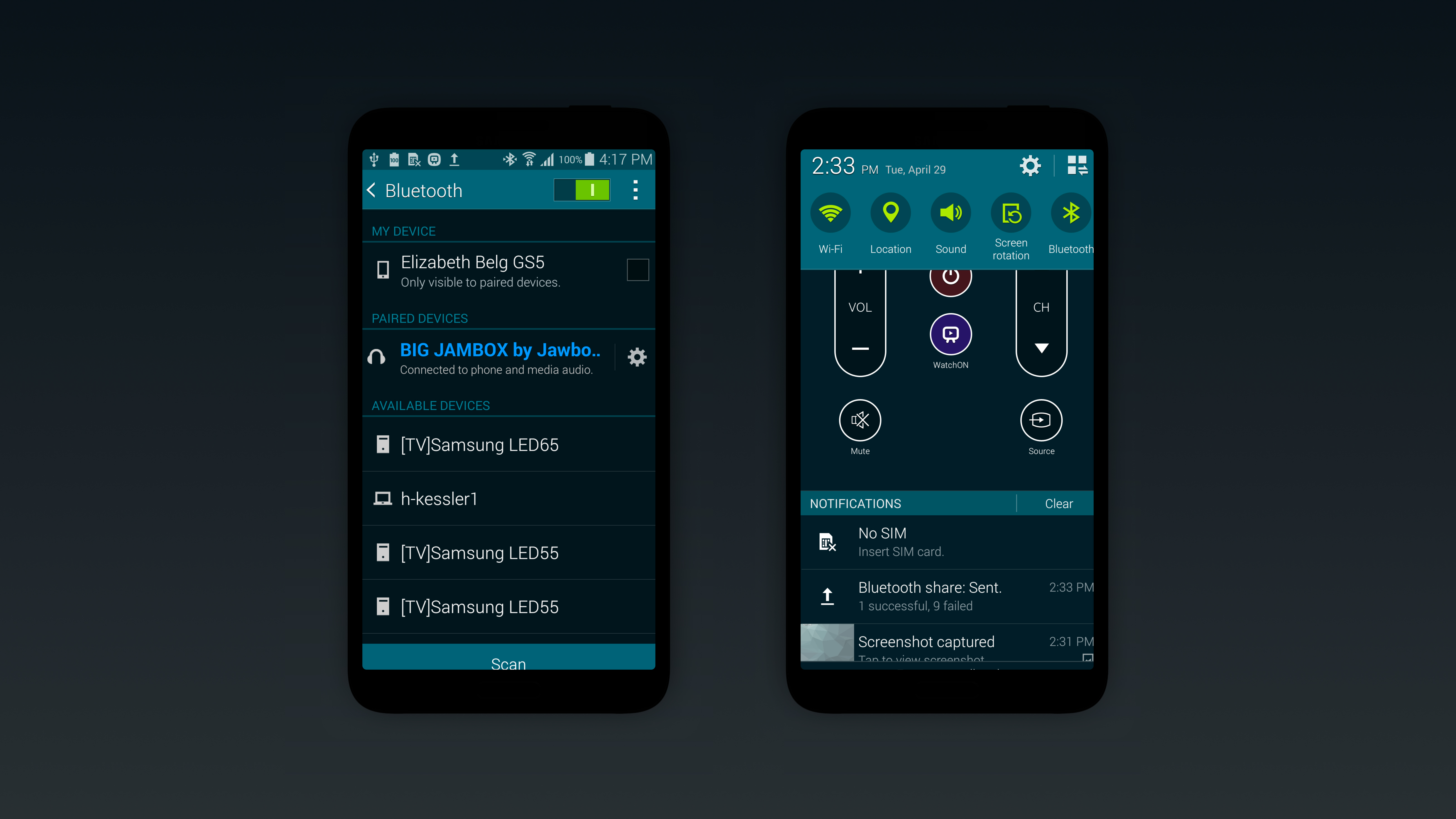
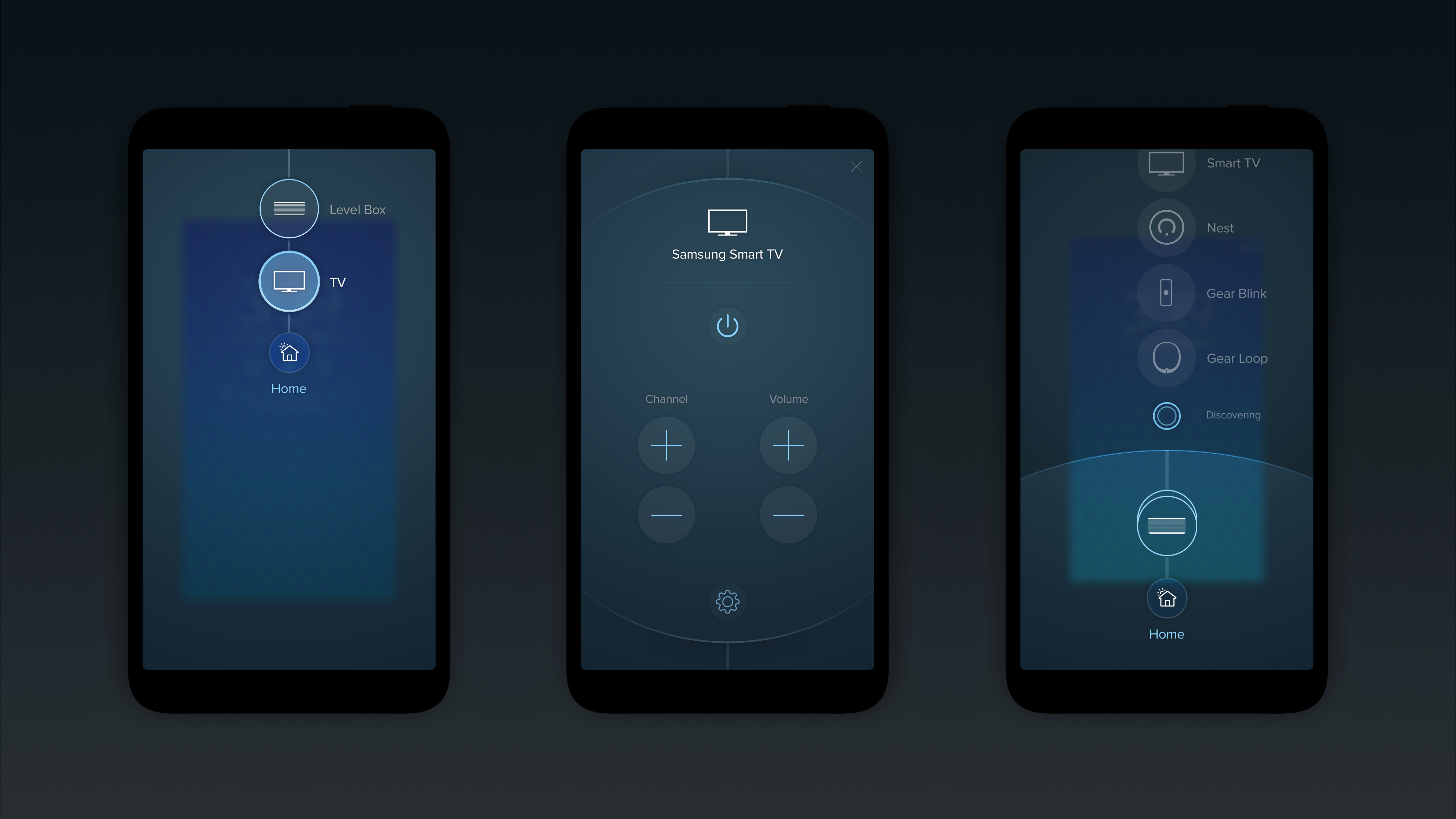
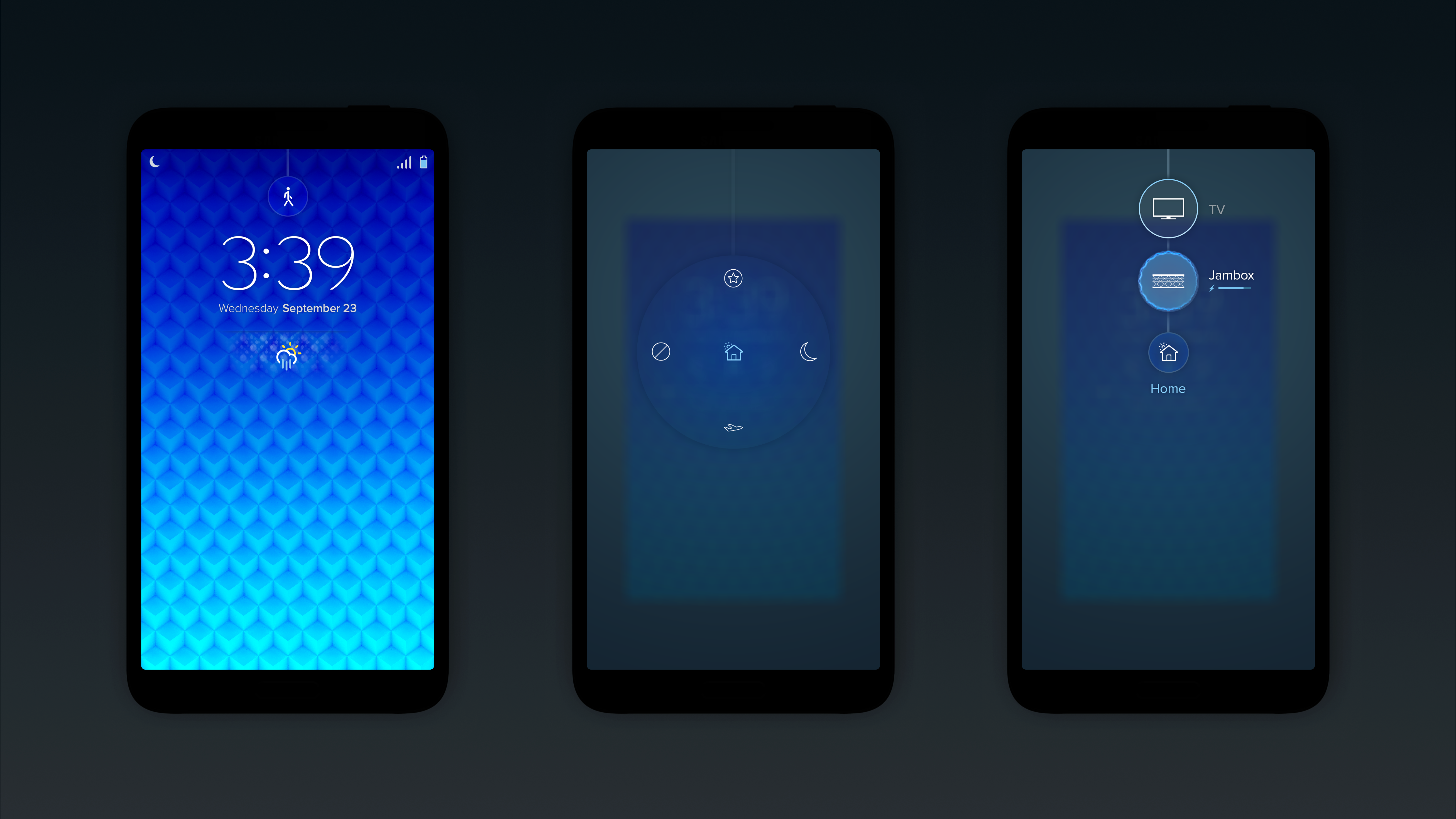
Build for easy and seamless connection with other devices
At home, the phone works as the hub of the house, helping users to connect to a wide range of devices. While on the go, users need a simple and quick connection and simple access to remain focused on their activities. Rethink how the OS and devices connect to improve the end-to-end experience.
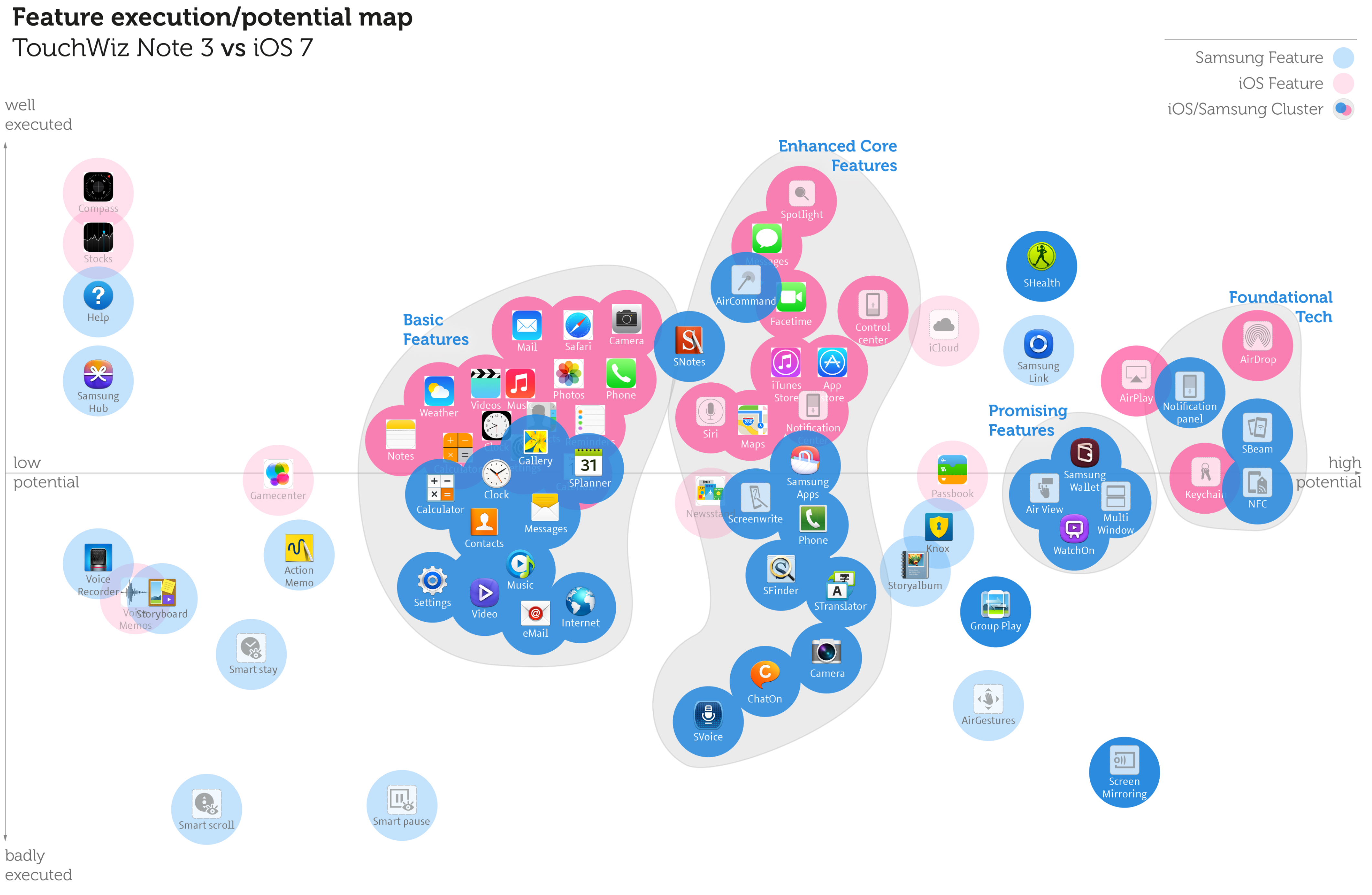
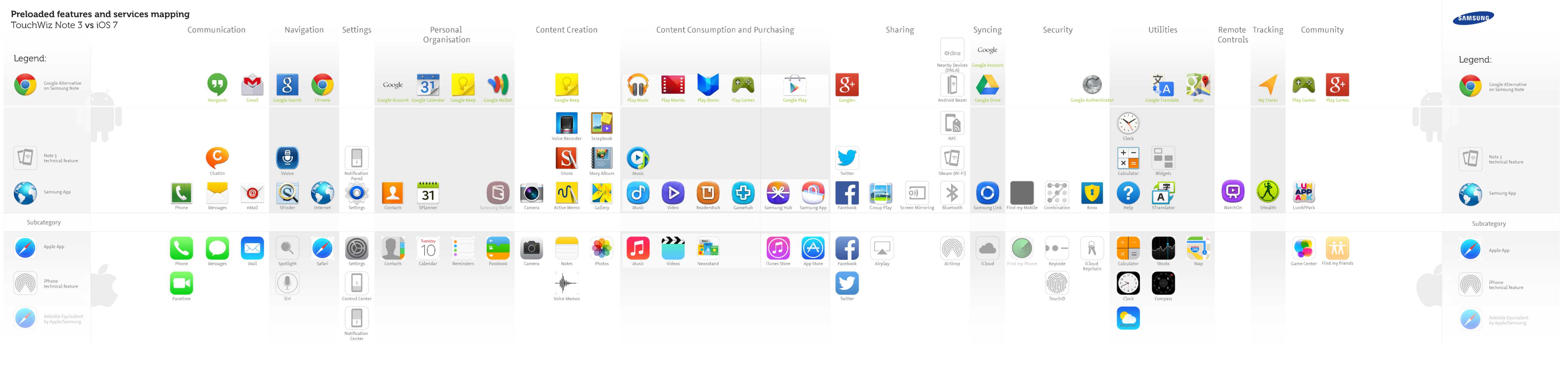
Major UX Problems
Major UX Problems
Major UX Problems
Major UX Problems
Opportunities
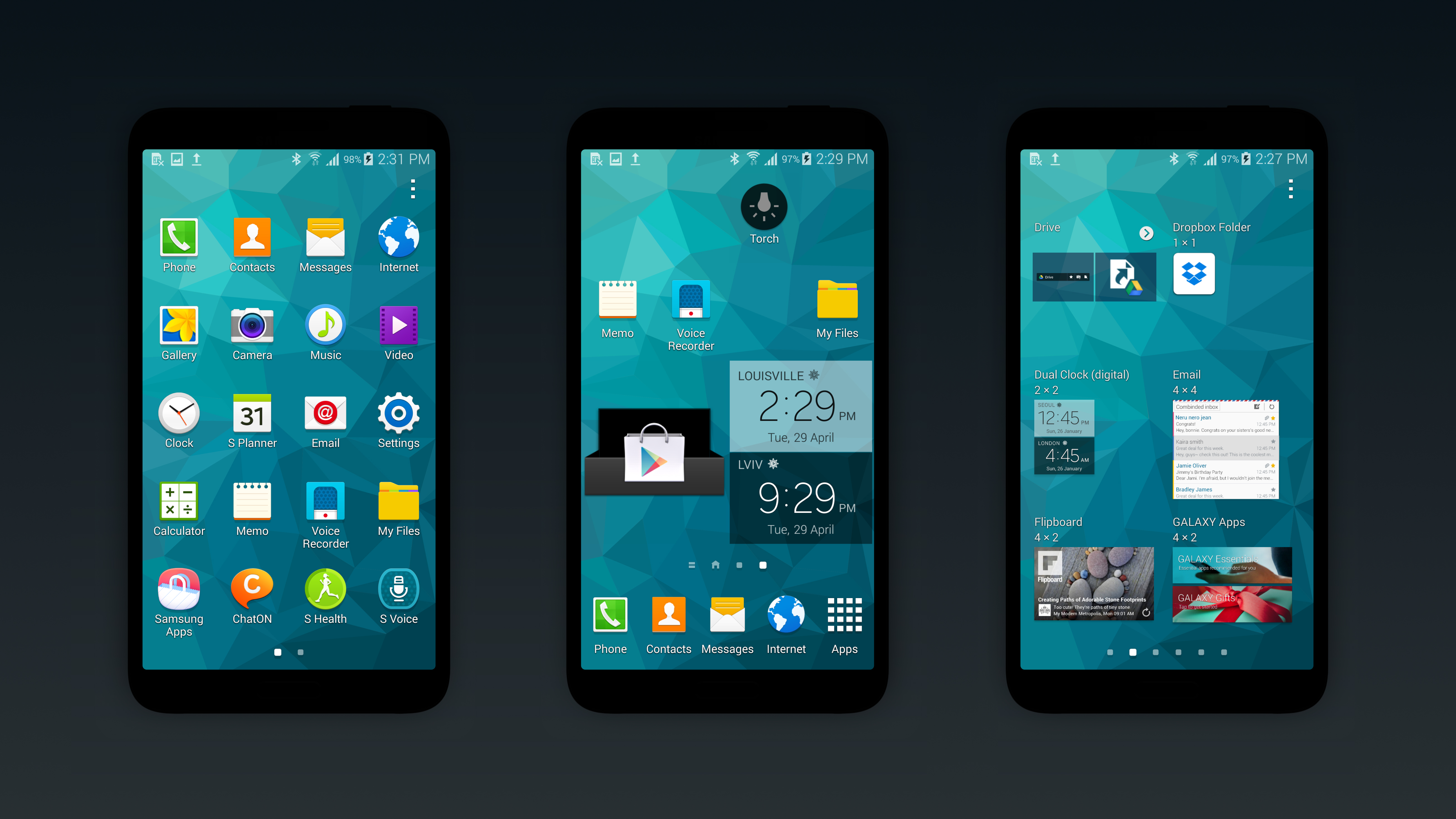
Solution
 Work
Work