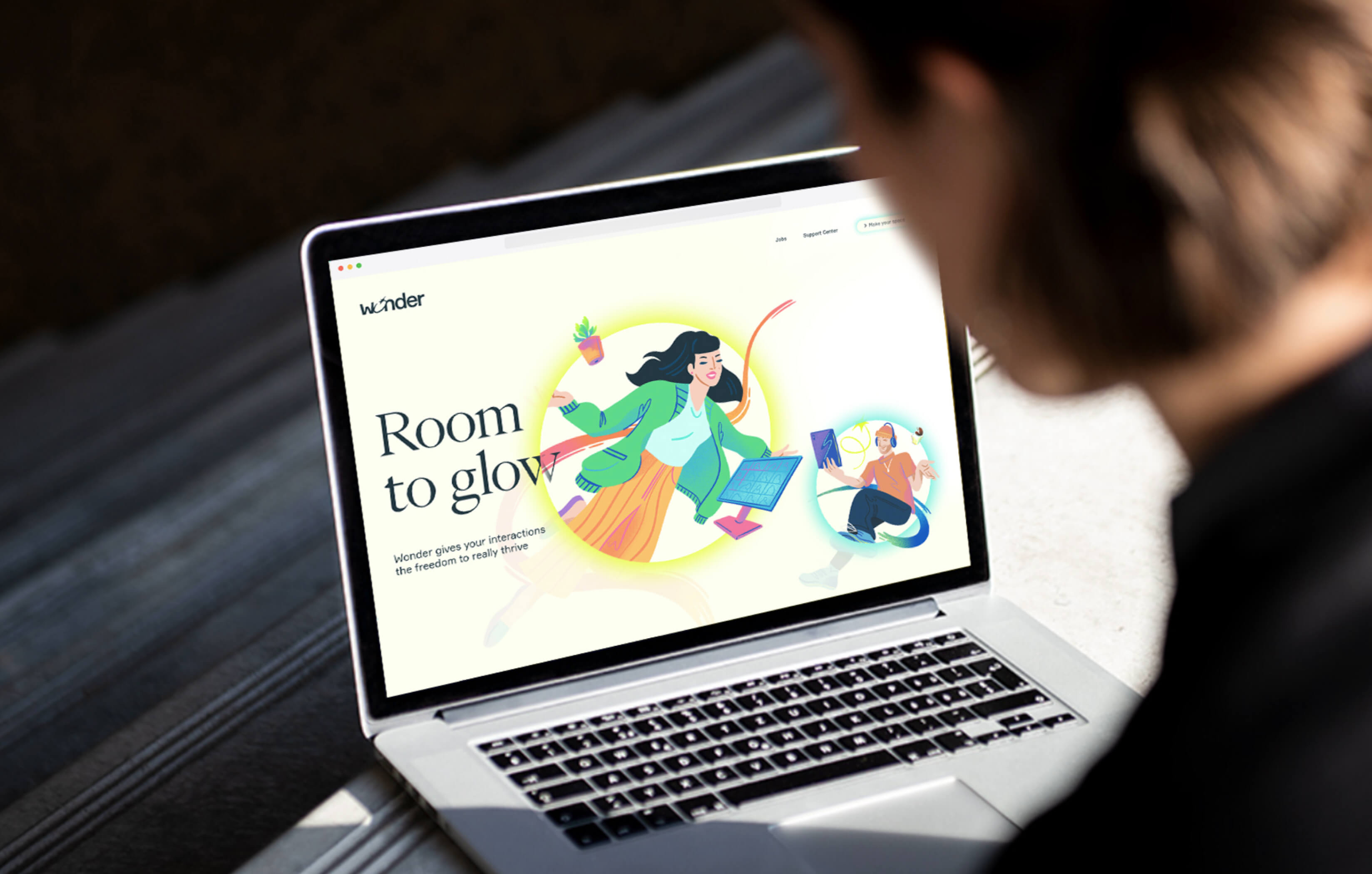
Wonder is an online gathering tool that seeks to create the best experience for large groups to meet, socialize, and attend presentations online.
Role
Principal Product Designer/Head of Design
Challenge
Following Wonder's hyper-growth phase, where the company grew from 0 users to 1M monthly users during the pandemic, Wonder needed help to retain and attract new users. This shift in user habit pointed to the necessity for the product to reevaluate its original principles, opportunities, and focus.
Contributions
After observing this shift, I focused on developing a more comprehensive product narrative to serve as a new brand's foundation. Additionally, I led the development of the branding system and, later, the new design system and product redesign.
Impact
The output of this exercise brought focus and confidence to the team to execute more effectively and plan the development of more complex project iterations. Wonder's brand and product narrative had a short-term impact by enabling the product to communicate its value to its core audience effectively. Internally, the new product narrative gave product teams clarity to focus on core user problems.
After experiencing a hyper-growth phase, where the product grew exponentially across various use cases, Wonder lacked a clear direction for where to go next. Metrics such as retention and NPS were on a downward trajectory, and the influx of users that the team grew accustomed to stopped as quickly as lockdown measures loosened up.
There were conflicting hypotheses explaining Wonder's decline across the organization with no decisive paths forward. Aside from never developing a robust visual system that matched the product's value proposition, a strong brand was only one of many problems that challenged the product.
Developing a cohesive product narrative
Before developing a visual identity, I wanted to put an overall narrative that included different aspects such as industry, technology, user habits, competition, and user needs. Until then, our insights had been either too micro (usability issues) or too macro, which often overwhelmed internal teams rather than empower them to make decisions.
When Wonder was released, the video conferencing space saw the emergence of new tools all trying to take a small piece of the pie. How are user habits changing, and how do we best build certainty for the near future? What would the ideal experience be like for our core users, and do we have the technical expertise to make it happen?
Gatherings, not video conferencing
For gatherings where the dissemination of content is the priority, tools like Zoom and Google Meet deliver the best presentation experience. But as we transition to a remote-first environment, social cues from co-workers and the ability to emotionally connect with attendees before and after a presentation are as important (if not more important) than the content. After all, going to a conference has more to do with the conversations and people you meet there rather than the content presented.
How often have you left an online event feeling worse than when you joined? Socializing online using tools that were not designed for social connection is hard. Async communication tools like Slack and online conferencing tools like Zoom will continue to have a space. Still, as we transition most of our interactions to online (work, social, study, etc.), we need more tools that bring the affordances from physical spaces to interactions online.
Gatherings that leave you energized
The future we're designing for is one where teams are distributed, but the need to be together in one shared space is still present. Whether to get together on Fridays or work together on a project, Wonder's core UX is simple, fun to use, open, and built for organic interactions.
We create online spaces where the content you share matters as much as the feeling of being present with others in the room. We create gatherings that make you leave energized.
Visual Explorations
After synthesizing our learnings, I shifted my focus to designing execution. For this particular phase of the project, I worked with folks at Design Studio to help me execute and develop a brand identity. The manifesto I wrote worked as a guide to our visual explorations. From the core idea, we developed mood boards as the starting points for visual explorations.
As we experimented with visual grammar and how they communicated Wonder's message, I was focused on finding a language that worked well in marking materials and the product UI.
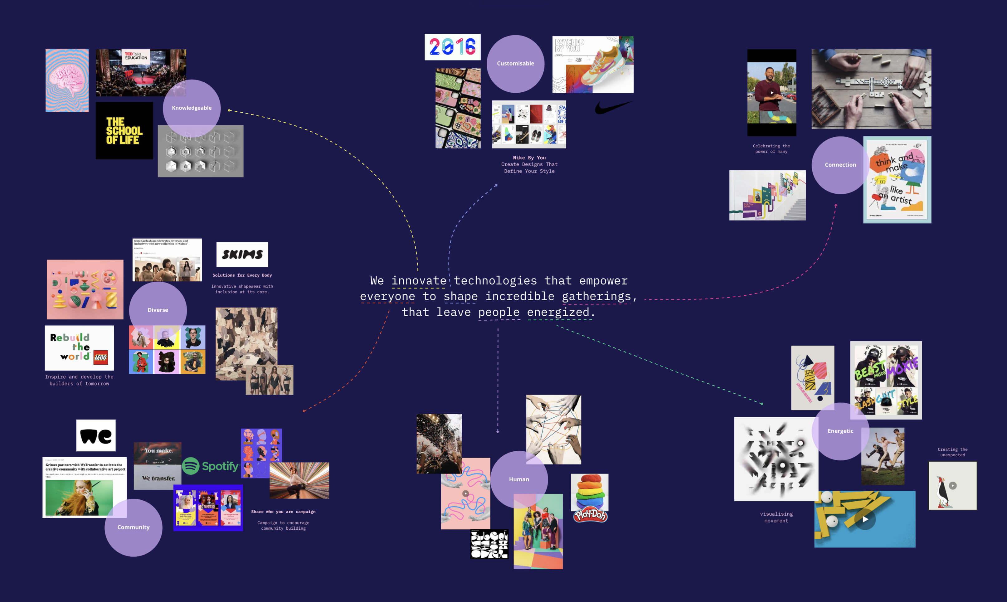
Opposition to existing tools
It was important for the new language to stand out from the competition as a product that offered something unique without being too silly or overly technical.
Built for human relationships
Unlike our competitors, Wonder's design language needed to be organic and open to juxtapose the rigidity that most conferencing tools display. I wanted the final language that felt open to creativity without being prescriptive.
I used the output of these explorations to validate their resonance with the internal team and users to indicate points for improvement by building upon those early experiments to see how other product elements would stand. I was interested in UI, motion, typography, and illustration across the critical parts of the application.
Concept 01
"Gatherings are communities where everybody is connected to everybody."

Concept 02
"It's about interaction and the exchange of ideas."
Brand Guidelines
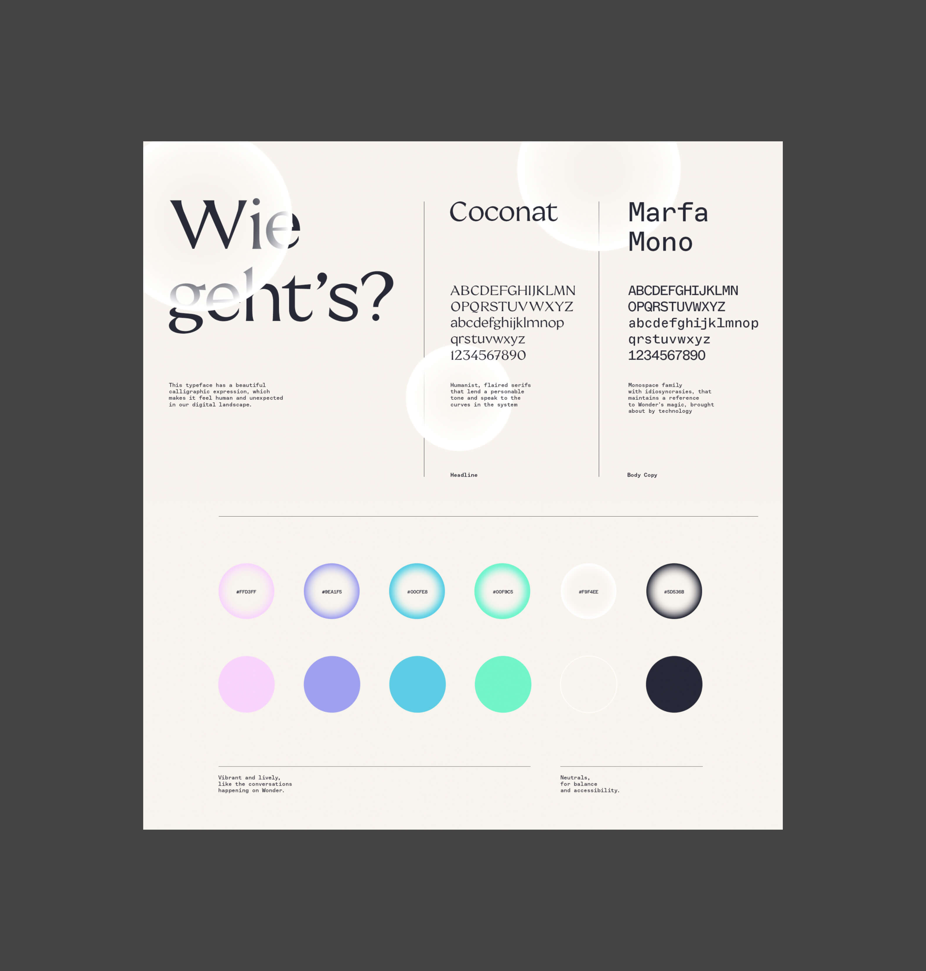
"We empower people with virtual spaces and tools to shape incredible gatherings that leave everyone energized."
The initial experimentations clarified aspects worth keeping and other points that didn't add to our message. For example, the illustration style of the Bubbles concept looked different from humans. Additionally, the color scheme was sterile, lacking vibrancy. Other explorations had other minor aspects that were successful but, as a whole, needed to add to create cohesive systems.
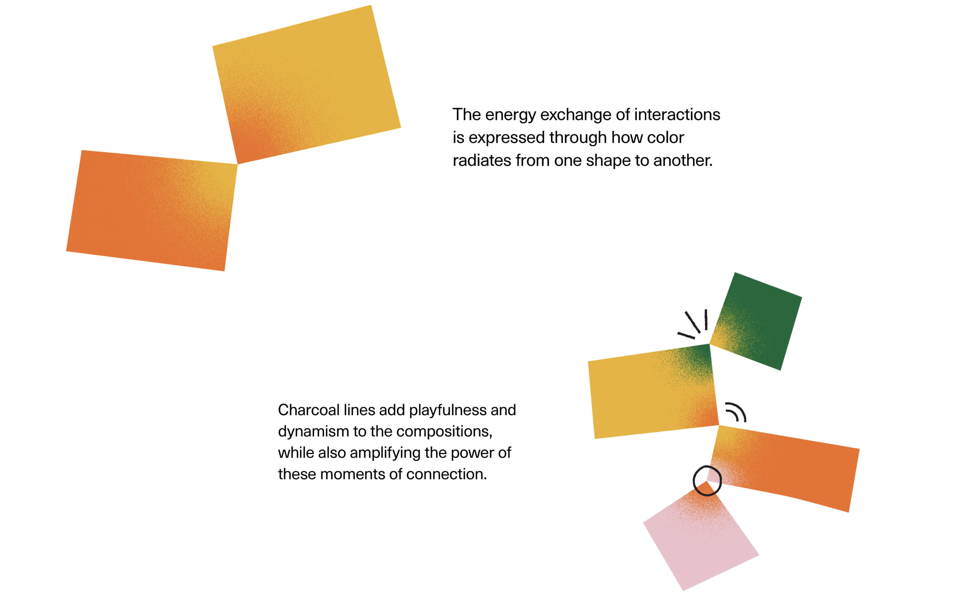
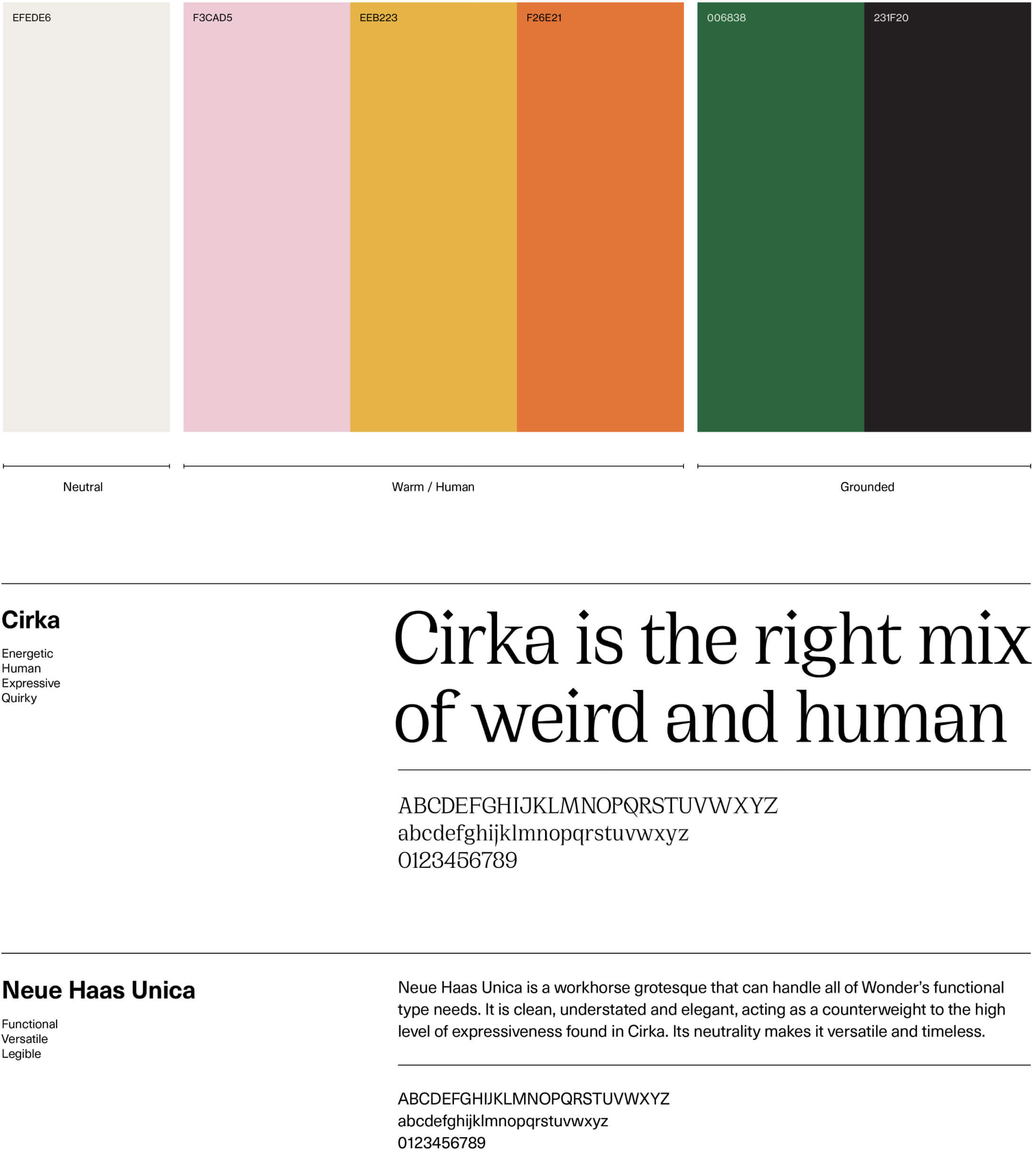
We settled on this final concept for a few reasons. The bubble concept paired with illustration was successful in communicating clearly what Wonder's message is. The vibrant color scheme gives the right flexibility to create the right tone of voice. The final type combination integrated a humanistic aspect I wanted to bring with a San Serif font with minor elements that added to the playful and organic message.
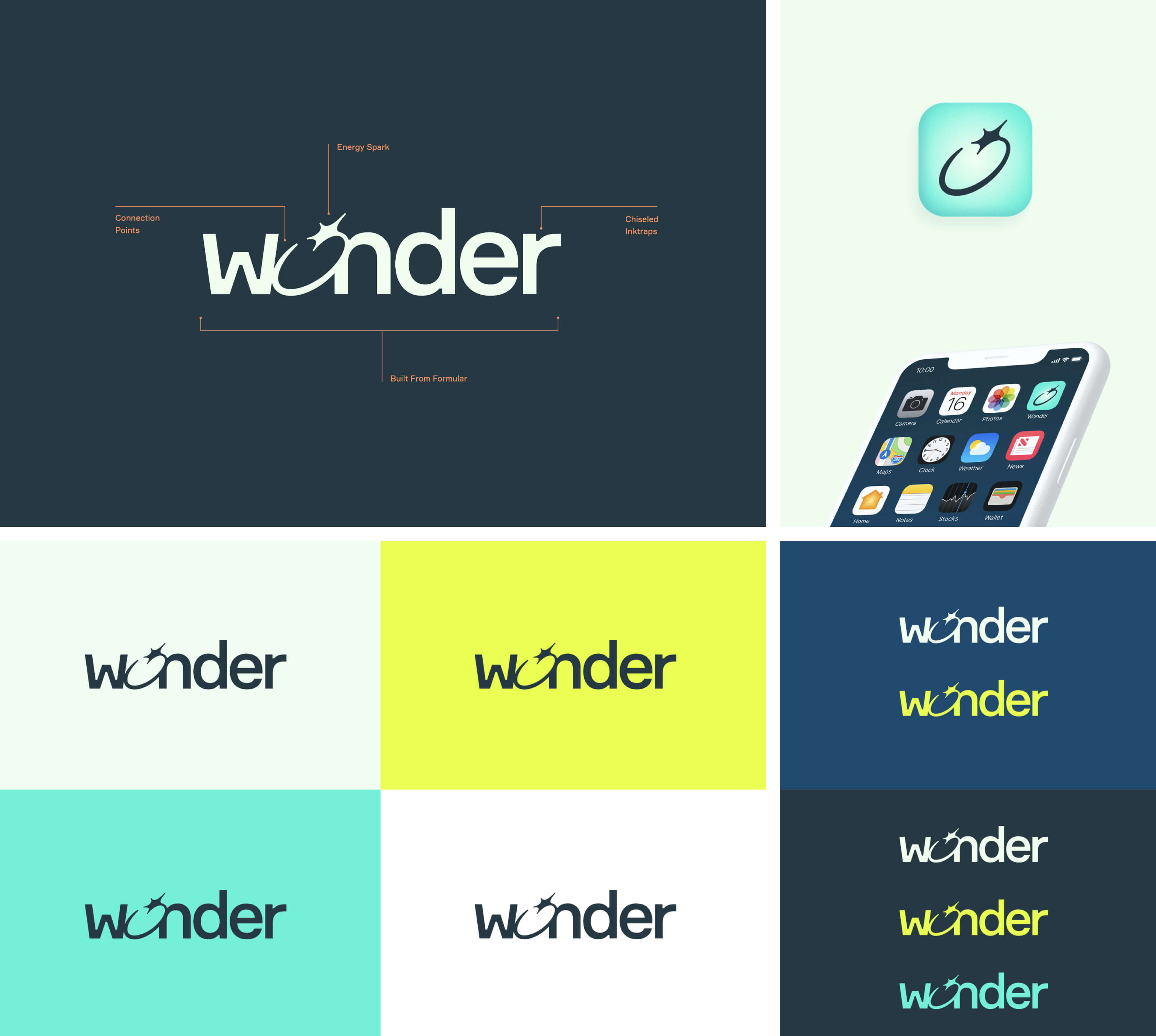
Wonder's custom wordmark embodies the energy we aim to catalyze within our users. It is playful and sophisticated, it took a few iterations to get it right, but the result captures Wonder's essence beautifully.
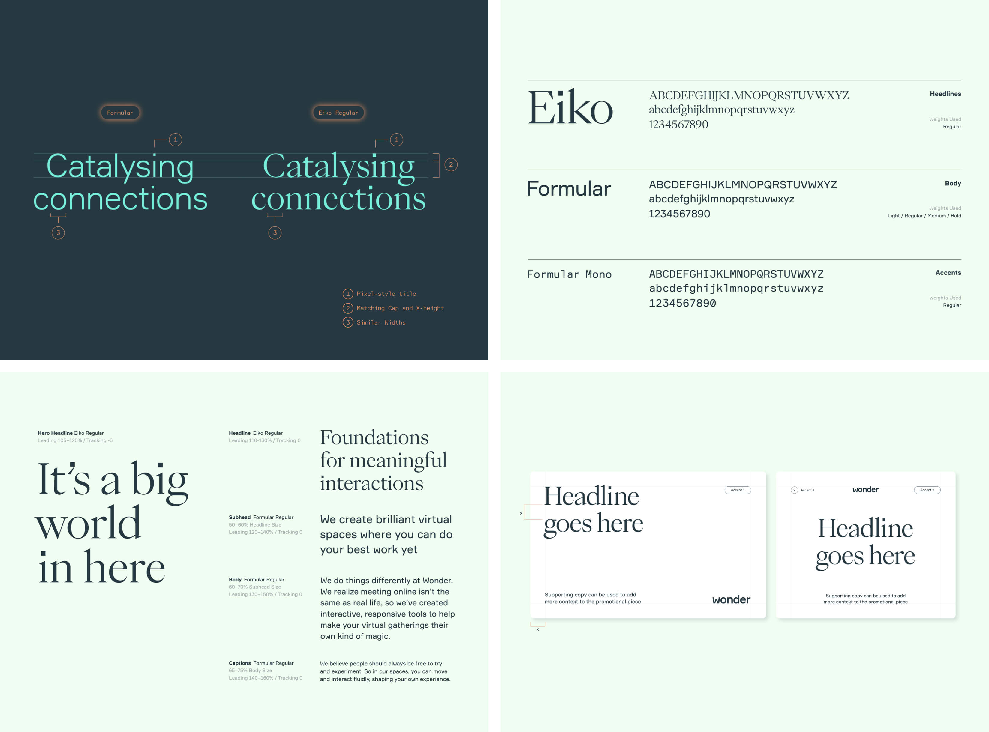
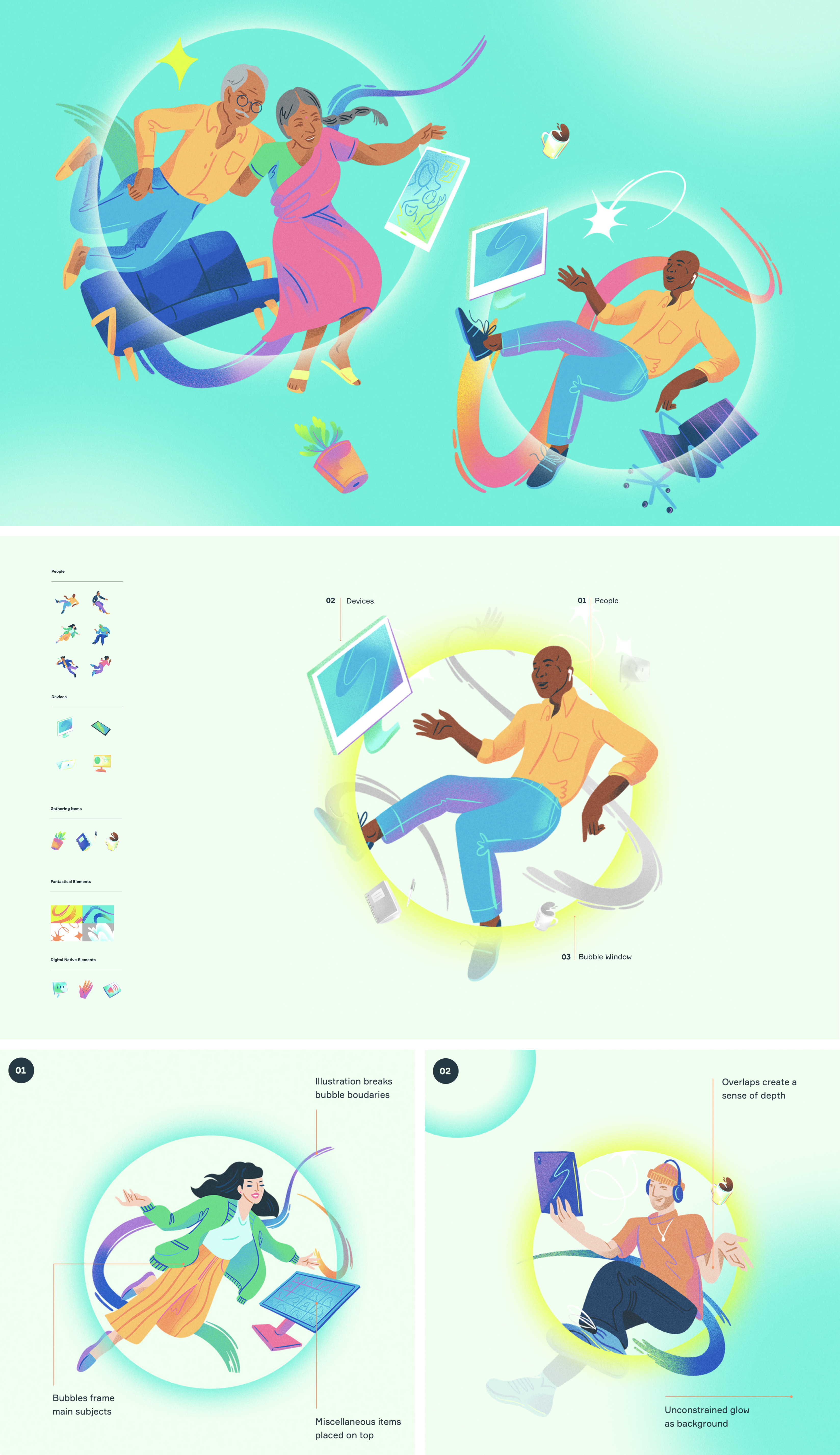

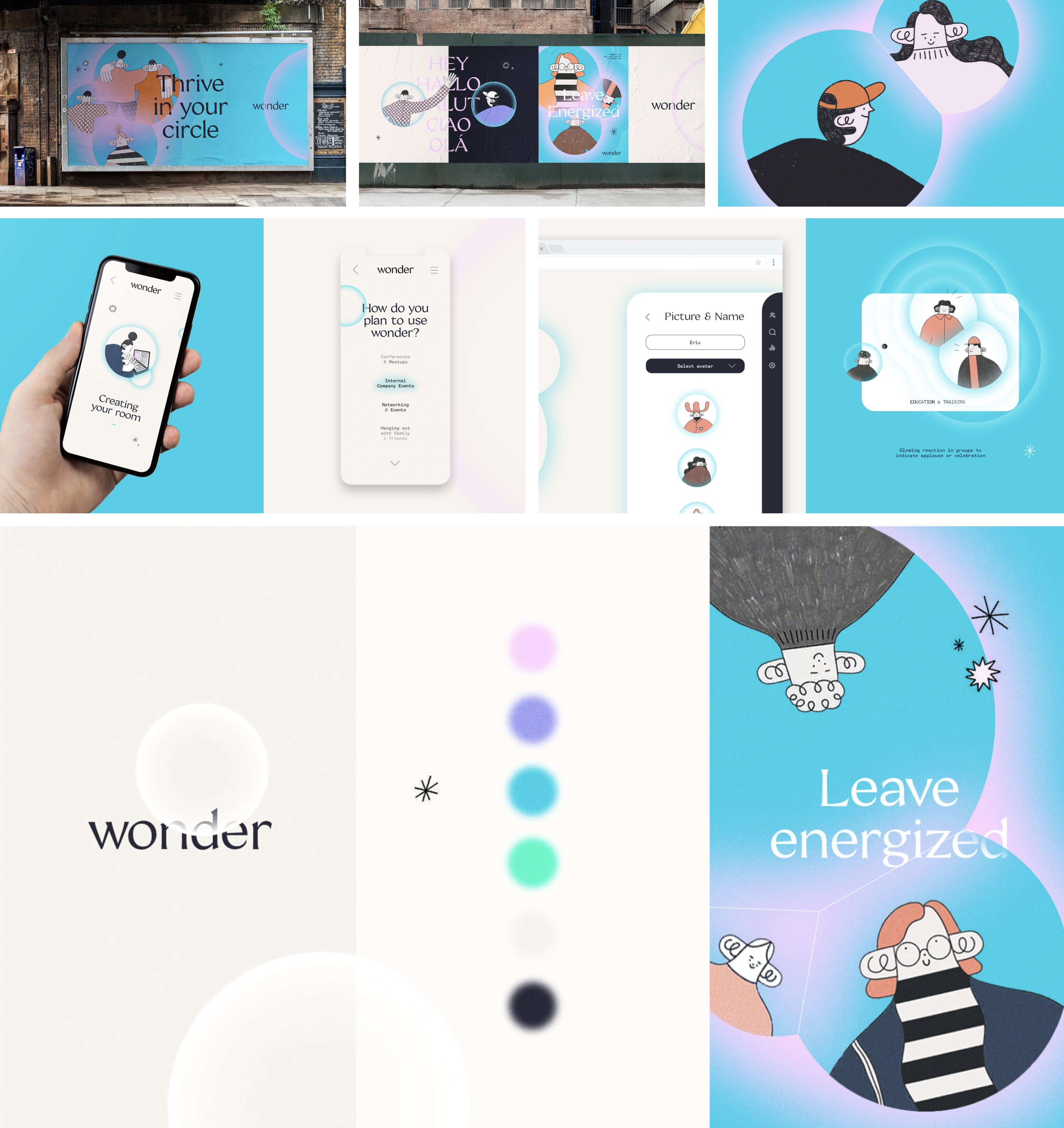
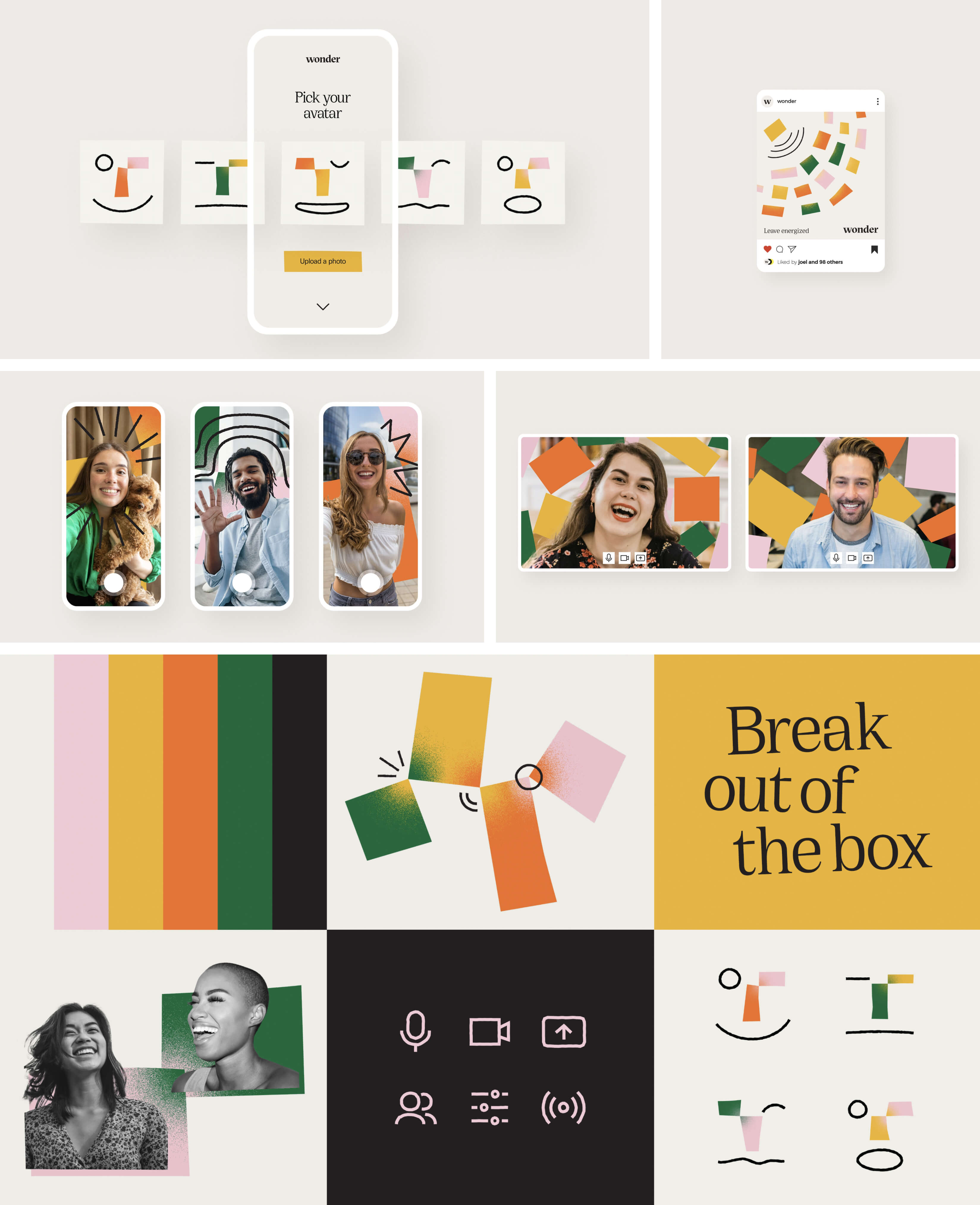
The final system was tested across many applications to validate its robustness across a wide range of applications. From these tests, it was easy to see the wide range of possibilities and how different elements could be combined to create the right tone for the task.
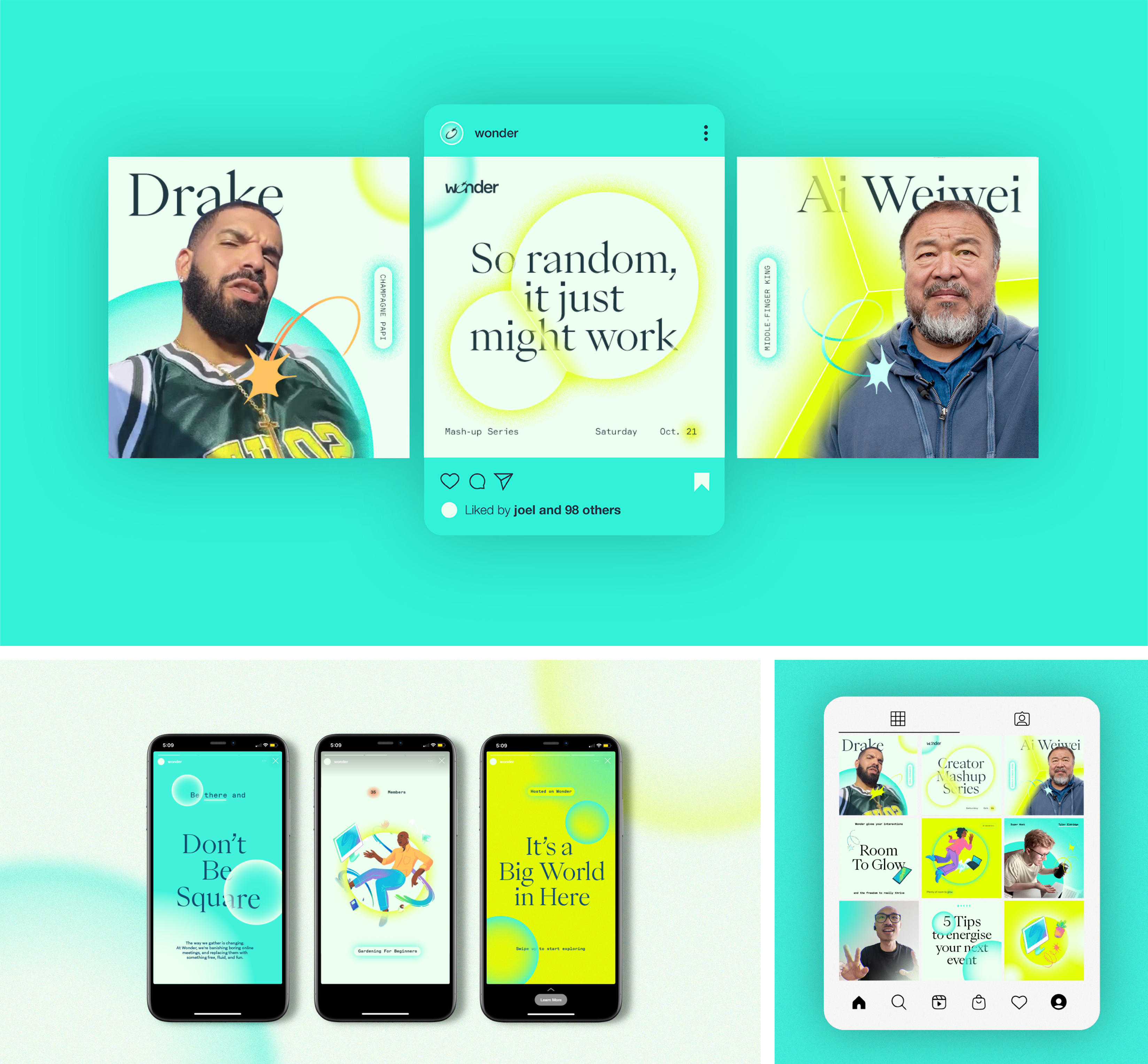
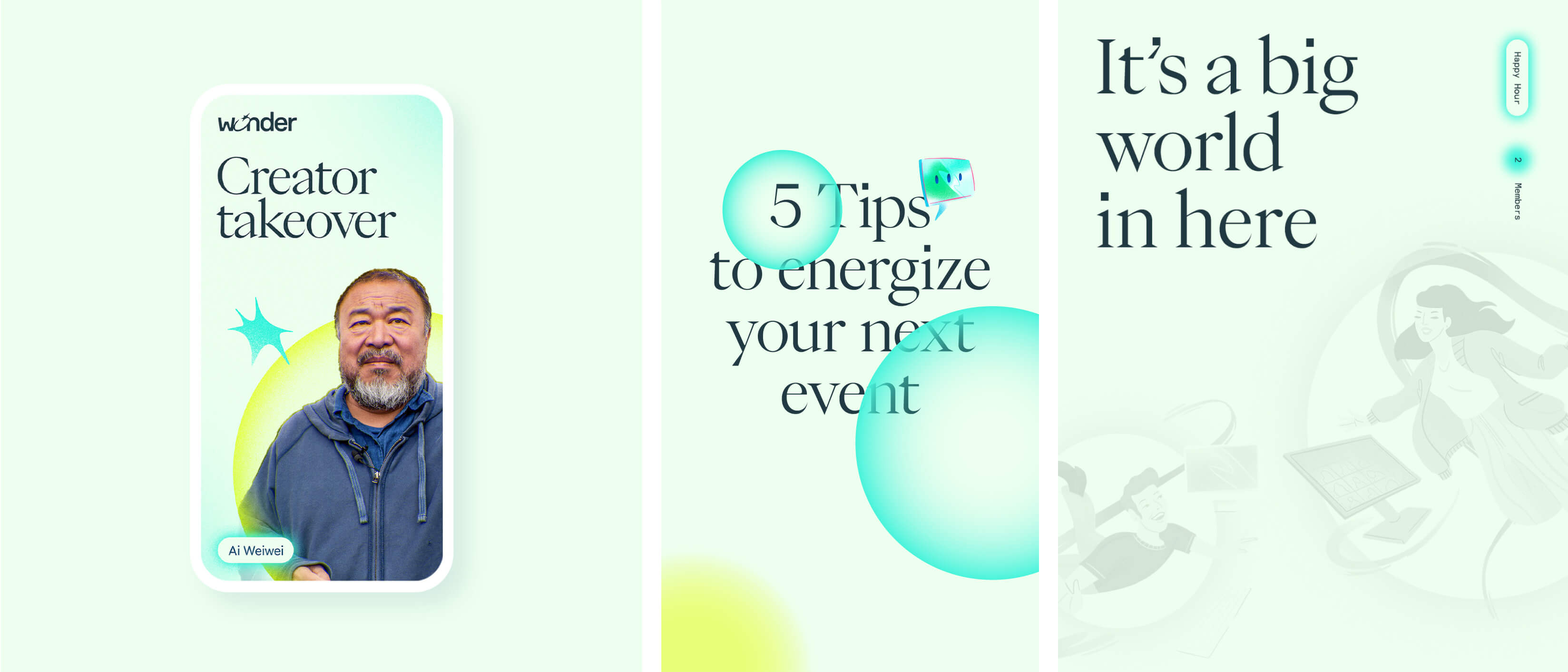
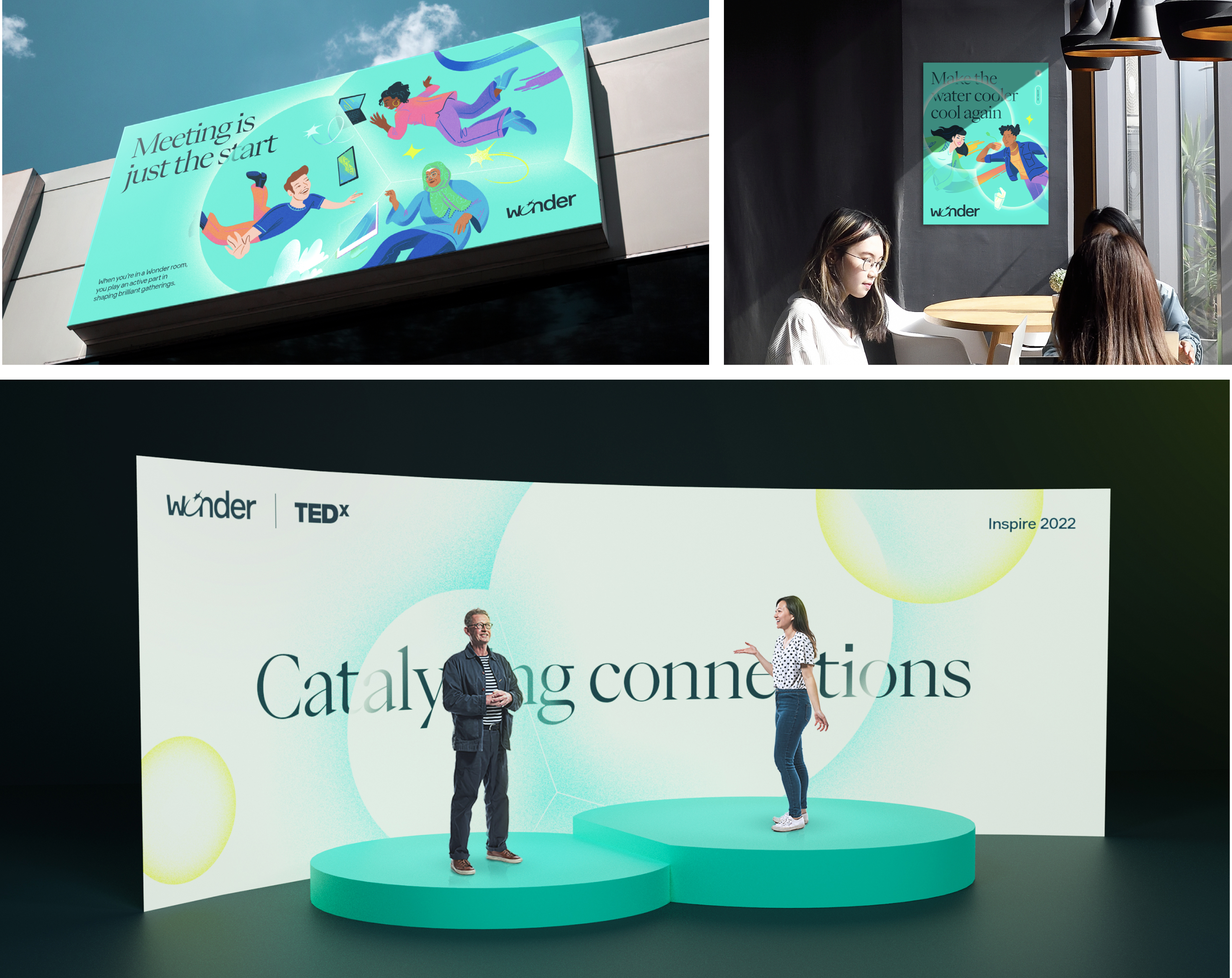
The final visual system and product narrative were essential to Wonder's next steps. Following its completion, I worked to expand the original brand guidelines to include UI and the primary product experience.
The strategy document I created directly impacted Wonder's ability to execute key challenges, removing the ambiguity in the product team.