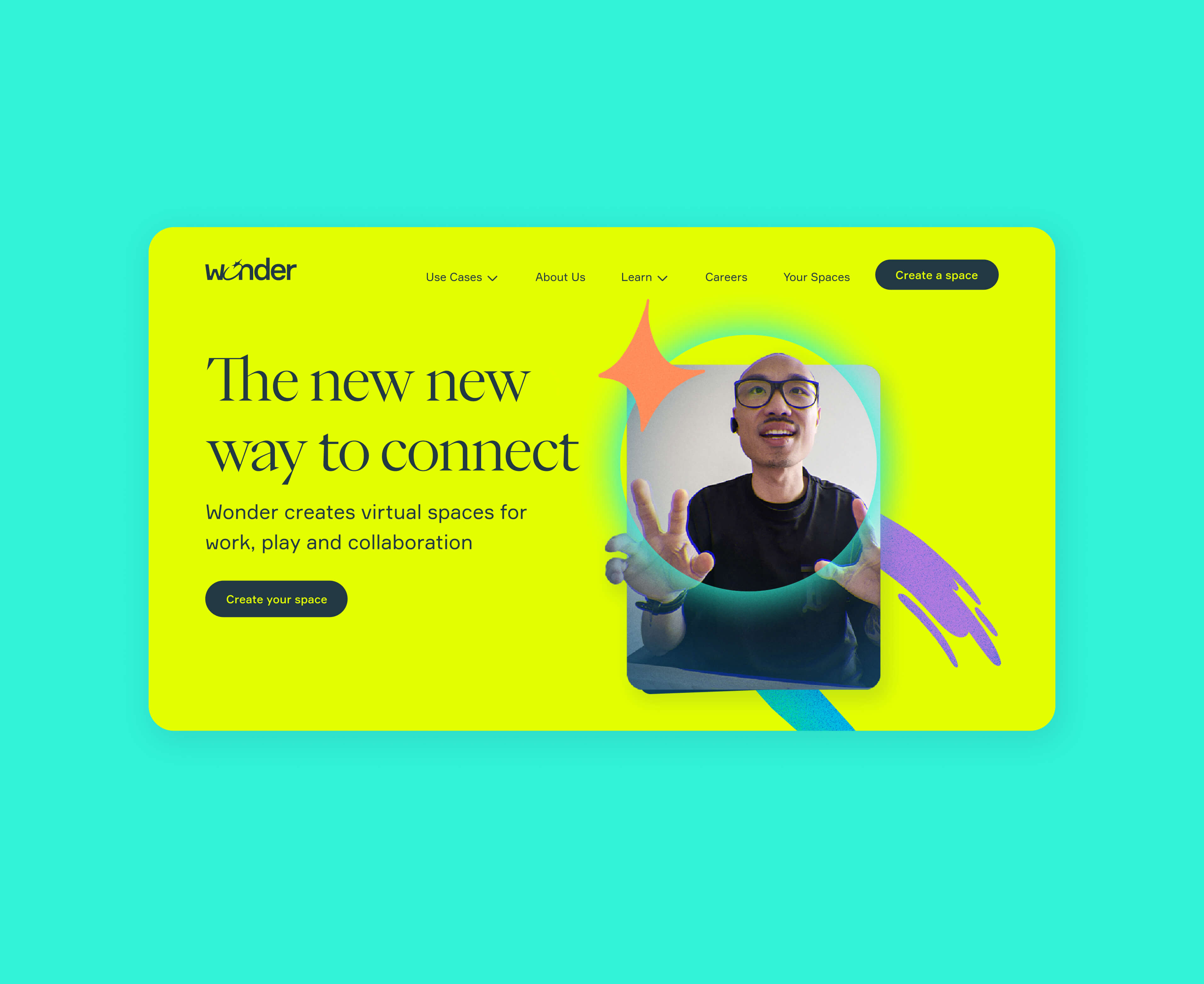
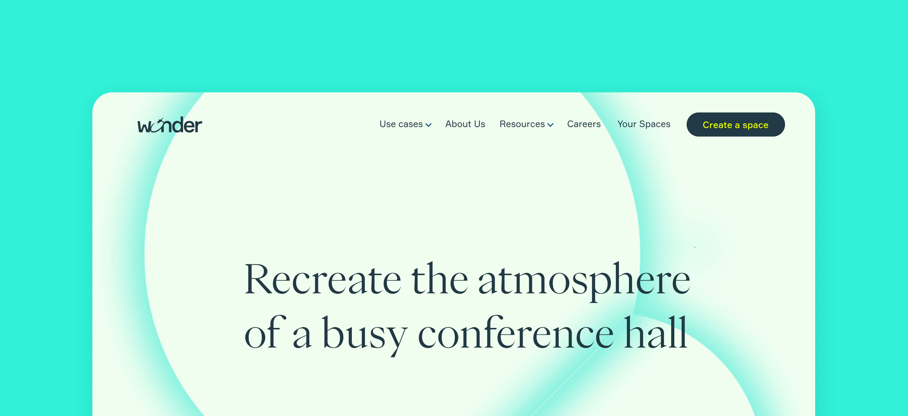
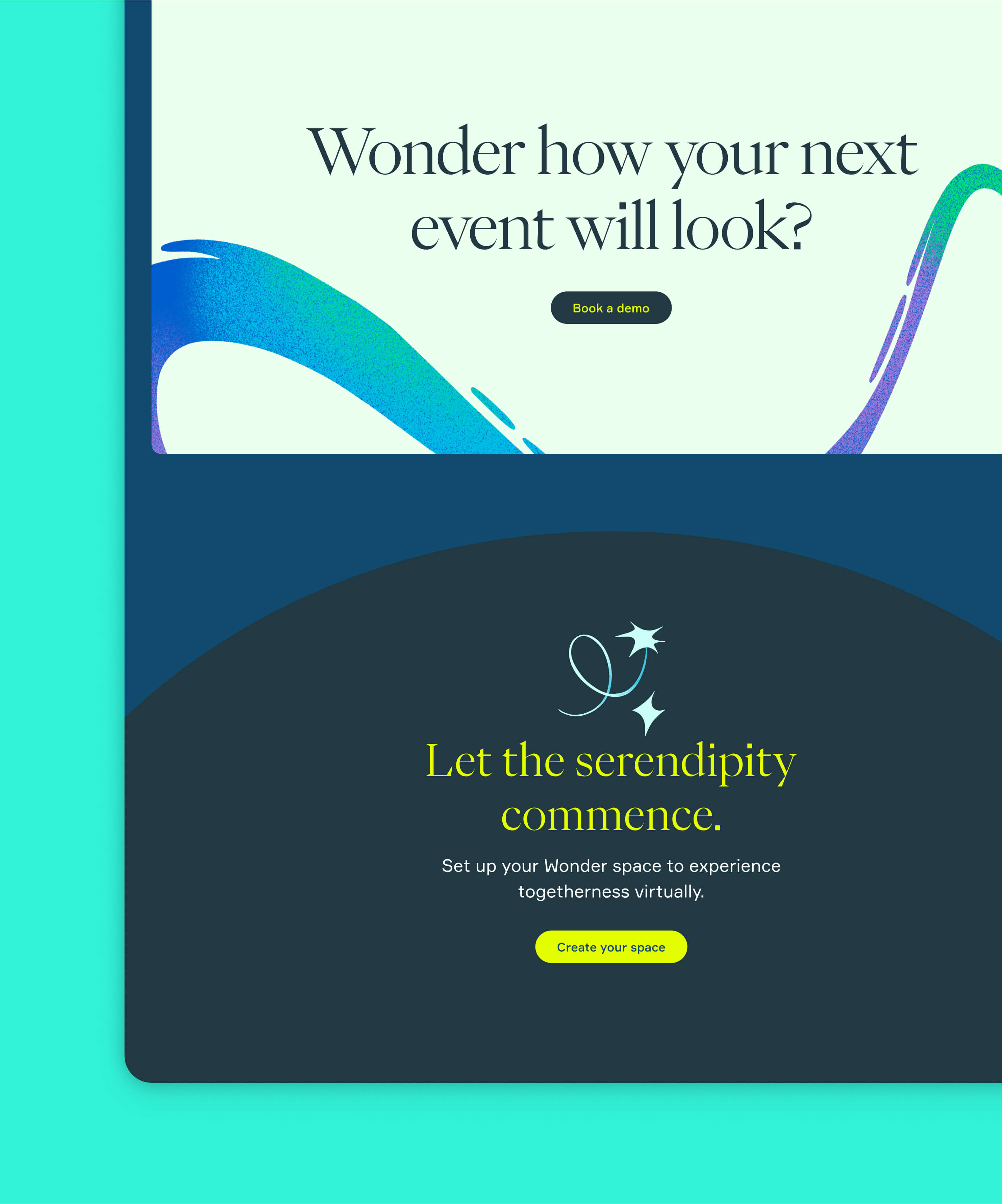
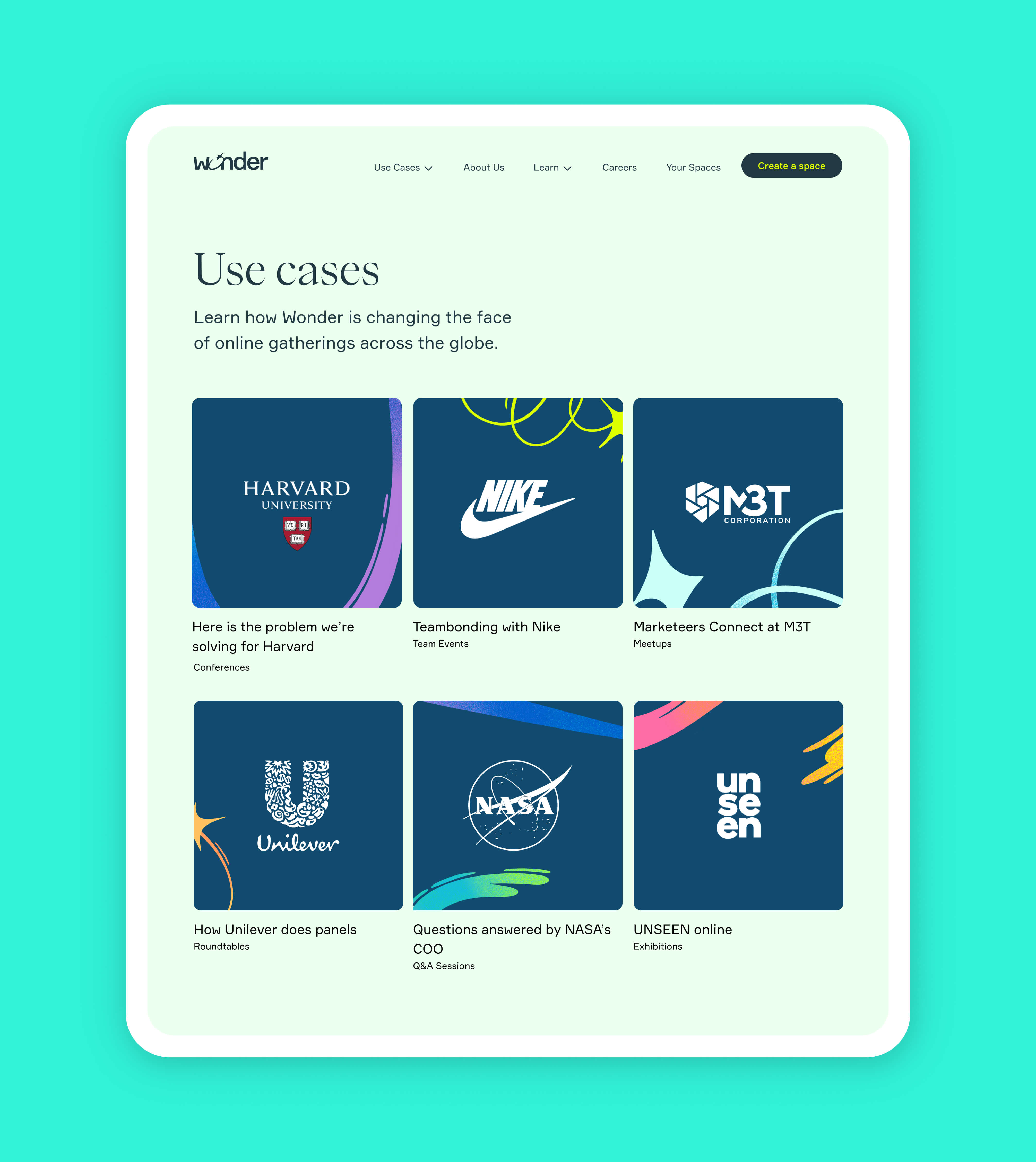
Wonder is an online gathering tool aimed at creating the best experience for large audiences on the web where they can meet, socialize, and attend presentations in ways that better resemble interaction in physical spaces.
Role
Principal Product Designer/Head of Design
Challenge
Following the development of Wonder's new brand, I was tasked to expand the brand visual system to include web and core UI elements. But over 14 months, with many new features and redesigns, Wonder accumulated a large design debt, increasing the project's complexity. Furthermore, Wonder's responsive strategy required a strategic approach to UI design due to Wonder's core meeting spatial model.
Contributions
I have worked with core stakeholders to define the project's success metrics and led execution from start to delivery.
Led a team of designers and engineers and executed core tasks, ranging from UI evaluation and implementation strategy to the final design system documentation.
Impact
The new design system allowed designers and product teams at Wonder to execute with higher confidence and higher quality. It enabled designers to focus more on user problems instead of solving complex UI challenges across various devices and sizes.
After completing the brand guidelines and product narrative, we had a clear path of where to take the product and well-thought-out brand guidelines. But to have a substantial product impact, we needed a design system that helped product managers, engineers, designers, and researchers to have one shared vision of how design problems should be solved. The combination of micro-interactions, information architecture, motion, icons, and look and feel all helped to make Wonder's mission of bringing people together in ways that feel more natural a reality.
I was part of the founding team and worked to bring the product from a small audience to a post-market fit stage. During this period, I was a principal designer and oversaw different aspects of the product experience, such as product strategy, design execution, and design hiring. After leading the design and execution of our new branding system, I led a team of two designers through the evaluation, experimentation, design, and validation of a fully-fledged design system that considered the end-to-end product experience. The result allowed us to speed up product execution and elevate the product experience.
Goals
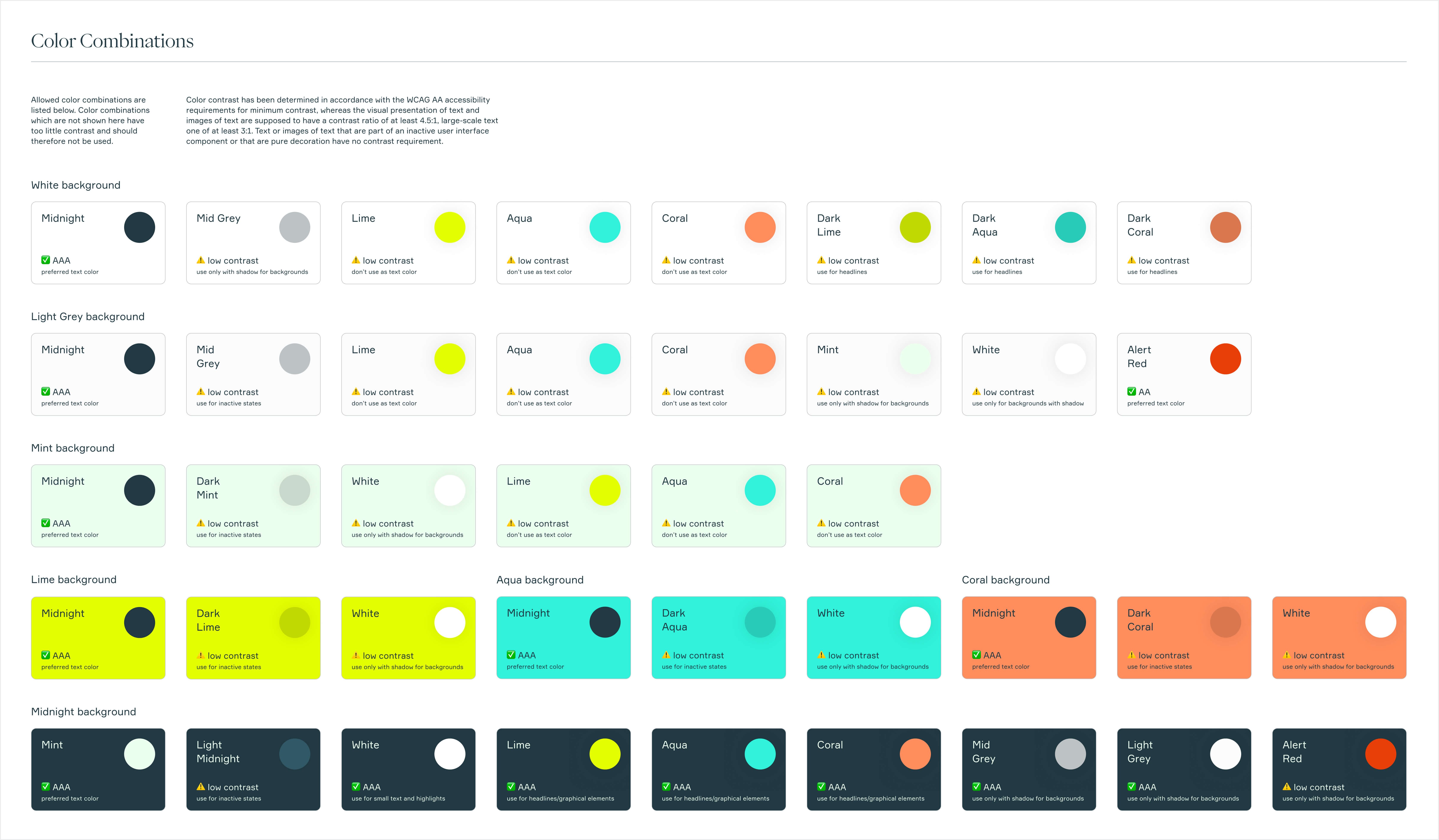
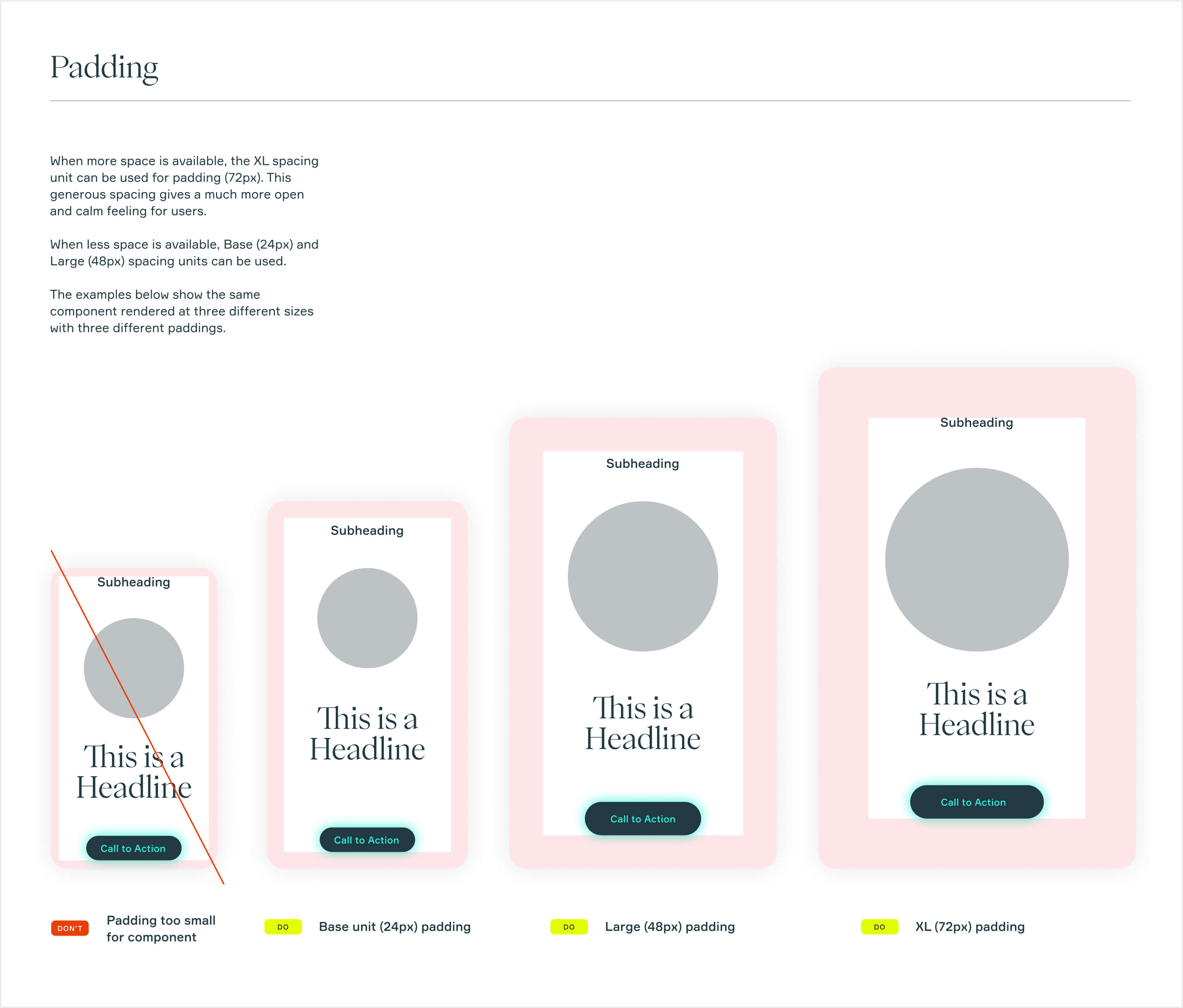
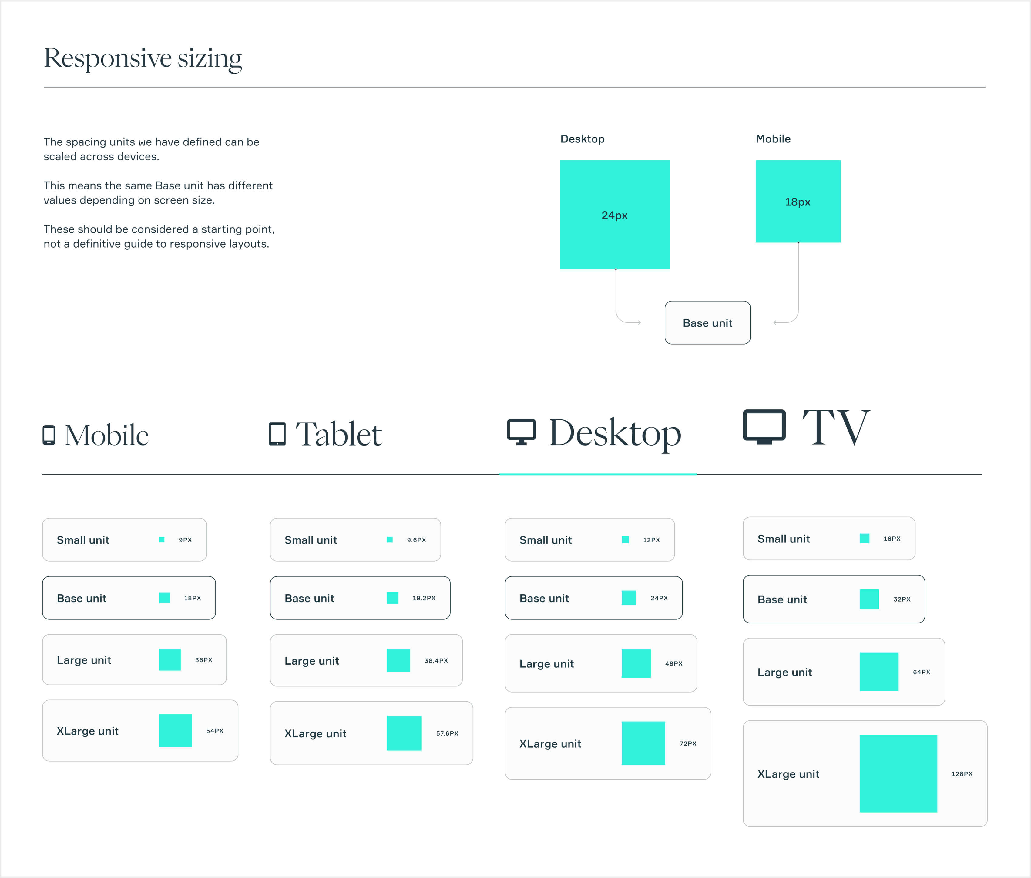
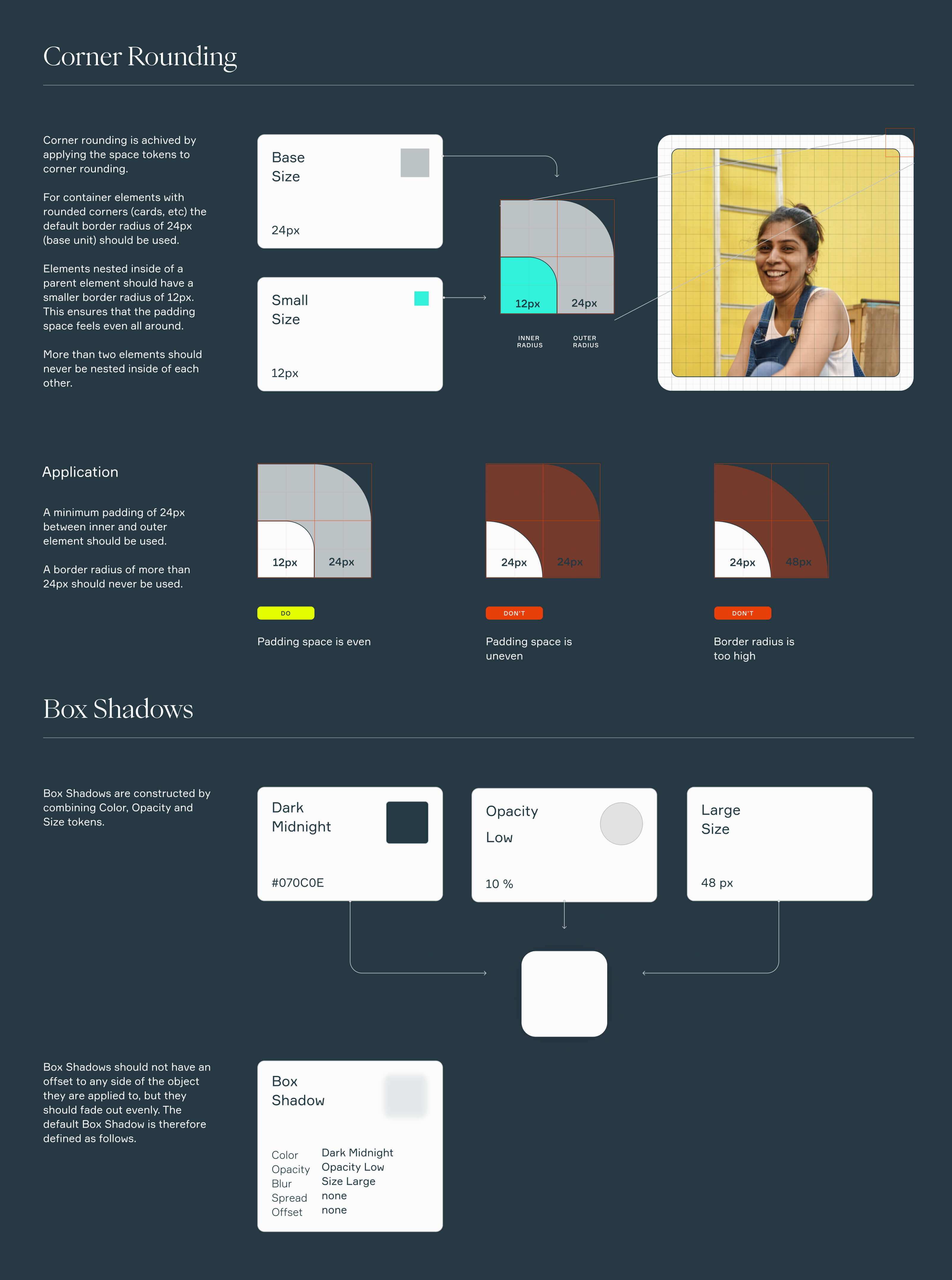
A design system is a set of tools and resources that help the team confidently make decisions. Design systems help bring consistency to the product experience by elevating the user experience and increasing the speed and efficiency of designing and building products. They are a source of truth and a system of record for our design decisions while also helping to protect the brand. Good design systems often go beyond the rules and include the why, when, where, and how.
1. Building and maintaining the new brand
The design system is how the brand speaks: a language and a set of tools specific to Wonder. Like any other language, sometimes it is loud, sometimes it is soft, sometimes it is pragmatic, and sometimes it is fun. A design system allows for new things to be added to this language while still adhering to the whole.
2. Bigger than the sum of its parts
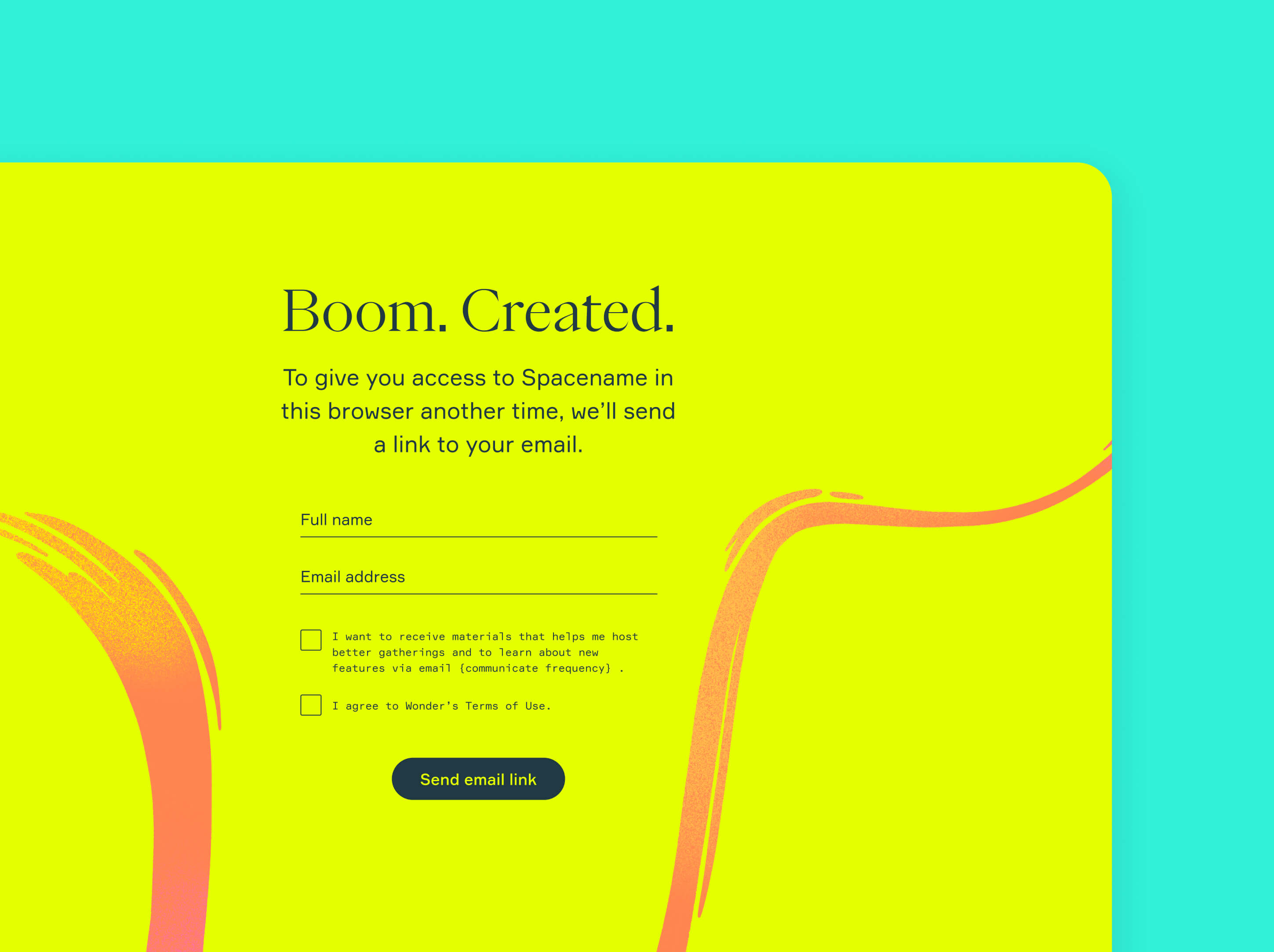
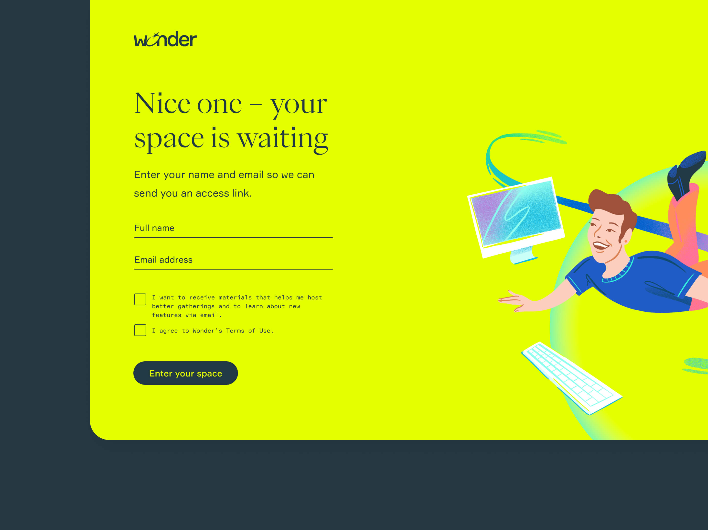
To have the product impact we desired, I wanted to look at the brand not only as the logo SVG and colors but as the sum of the experience users have with Wonder at every point, from the Button microcopy to Direct mail. Combining visual design language with other assets (motion, illustration, copywriting) creates a brand that feels unified, coherent, and true to the brand proposition.
To create this sense of unity, I first worked to identify the gaps where we can add interactions that bring the experience and the brand together (i.e., more 'alive'). It was essential to focus on both functional elements and our system's emotional and purely aesthetic aspects to create a coherent experience that matched the brand proposition we had identified earlier.
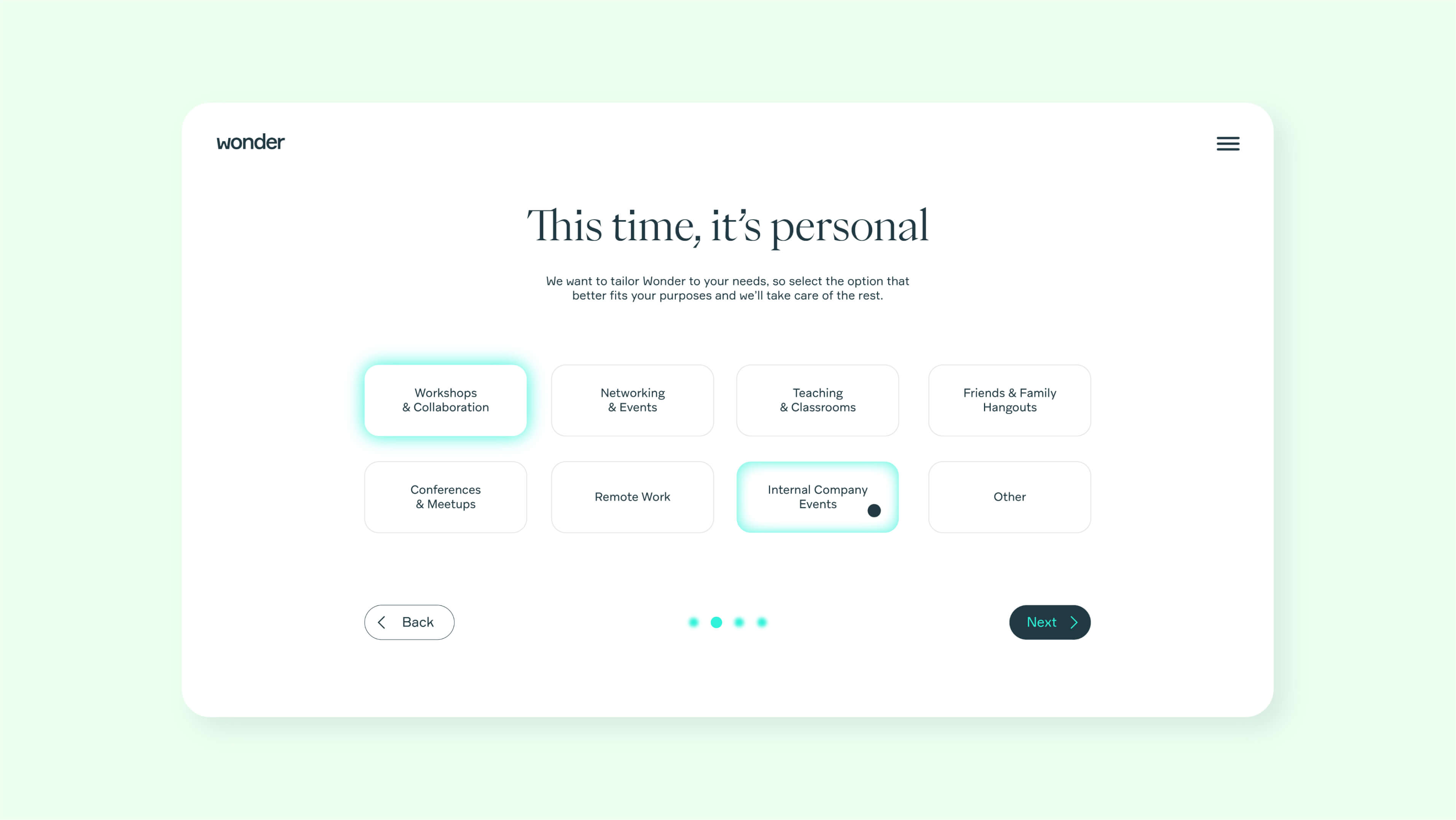
Instead of setting ourselves to build an extensive design system at first, I focused on delivering the equivalent of the minimum viable design system that allowed the project to gain traction in the team. Because of the high cost of developing a design system, from visual design to engineering, I wanted to keep the project scope in line with product outcomes and broader company goals. It's always easier to expand on a design system once the value it produces across an organization is clear to all product stakeholders.
1. Understand and map
The first focused on understanding and mapping the gaps between the product experience we wanted to create and the users' current experience with the product. We conducted interviews with users and workshops with product stakeholders to take their pain points and perspectives into account.
2. Principles and guidelines
In our second phase, we translated what we heard into principles to guide us in the execution phase. We presented the outcome of this phase to critical stakeholders to ensure we were aligned. For example, we needed to resolve the tension between function and aesthetics to define a guiding principle in how to use brand elements to communicate personally and facilitate ease of use from a usability perspective.
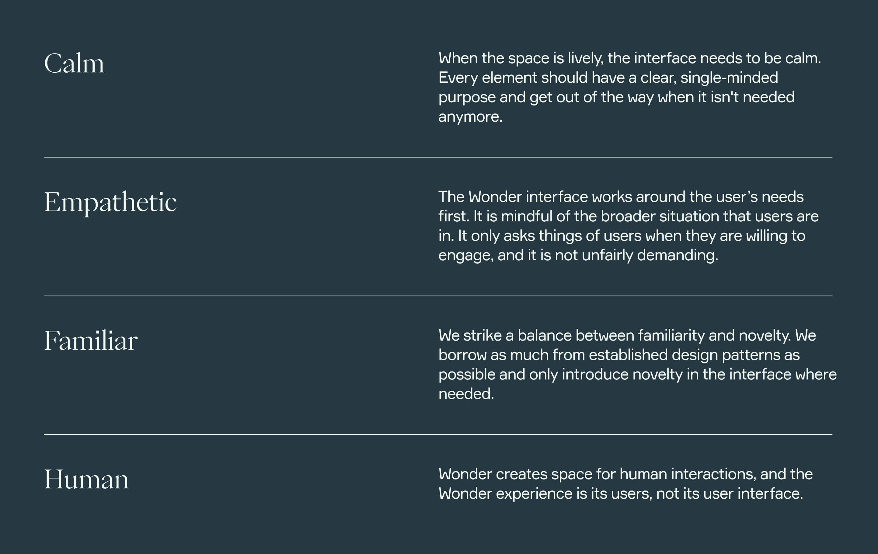
I turned the insights we gathered about the product experience into four principles to help guide our design explorations. These principles were built bottom-up and included the whole product team's input and considerations. We used these principles to clarify the gap between the present and future experience we wanted to create.
3. Build and validate
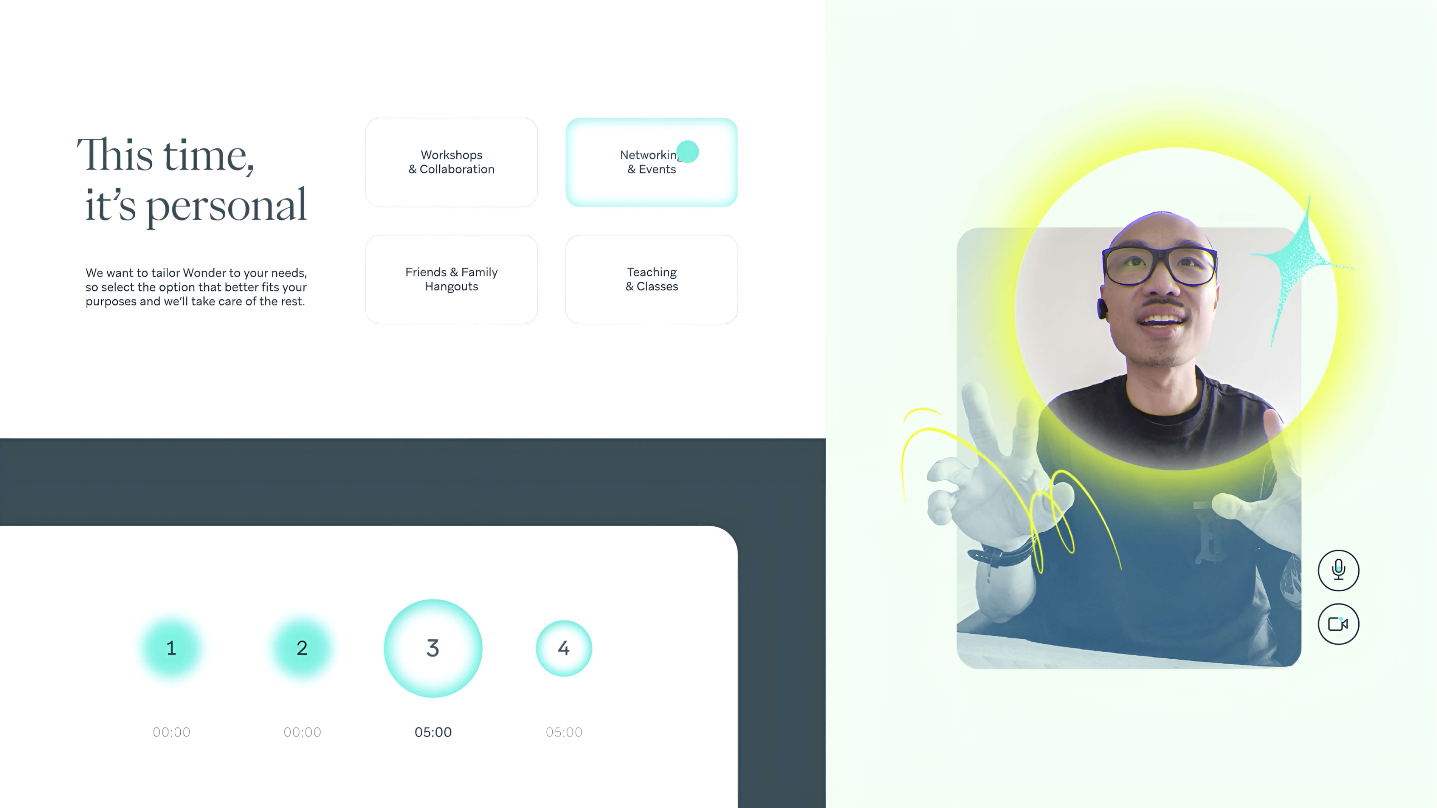
In the final phase, we used everything we learned earlier as guidance as we began our visual design explorations. We conducted small experiments on different parts of the product experience to build a cohesive set of rules. We looked into type, layout, and spacing across various elements to understand what worked and what elements needed more thought.
Once we had a solid base, we began by doing small design experiments to allow us to understand and test how simple rules could be put together to build a more complex set of elements. Every designer created a proto-design system to generate a wide range of options. Our goal was to use simple rules and elements to build more complex components and layouts to see how they behaved. For example, I did experiments focused on communication (Website) and heavy UI work (Meeting Experience). I explored color contrast, spacing, layout, tone of voice, and typographic hierarchy across many elements.
We showed these experiments to the team and presented them to users to validate usability, contract, and look and feel. From the experimentations of all three designers and the feedback we received from the team, we created a final system of building blocks we could begin in a short time frame.
In the context of a startup, even a simple design system can be challenging to pass and gain adoption. But we balanced the need for immediate results by focusing on simple building blocks rather than a fully-fledged comprehensive list of components. But this came with a caveat: due to the lack of components, our original set of building blocks was still used rather loosely by designers in the team. In retrospect, I would have liked to dedicate more time to working with the designers to build these components in the earlier phase rather than relying solely on documentation.
 Work
Work